
FoodBot
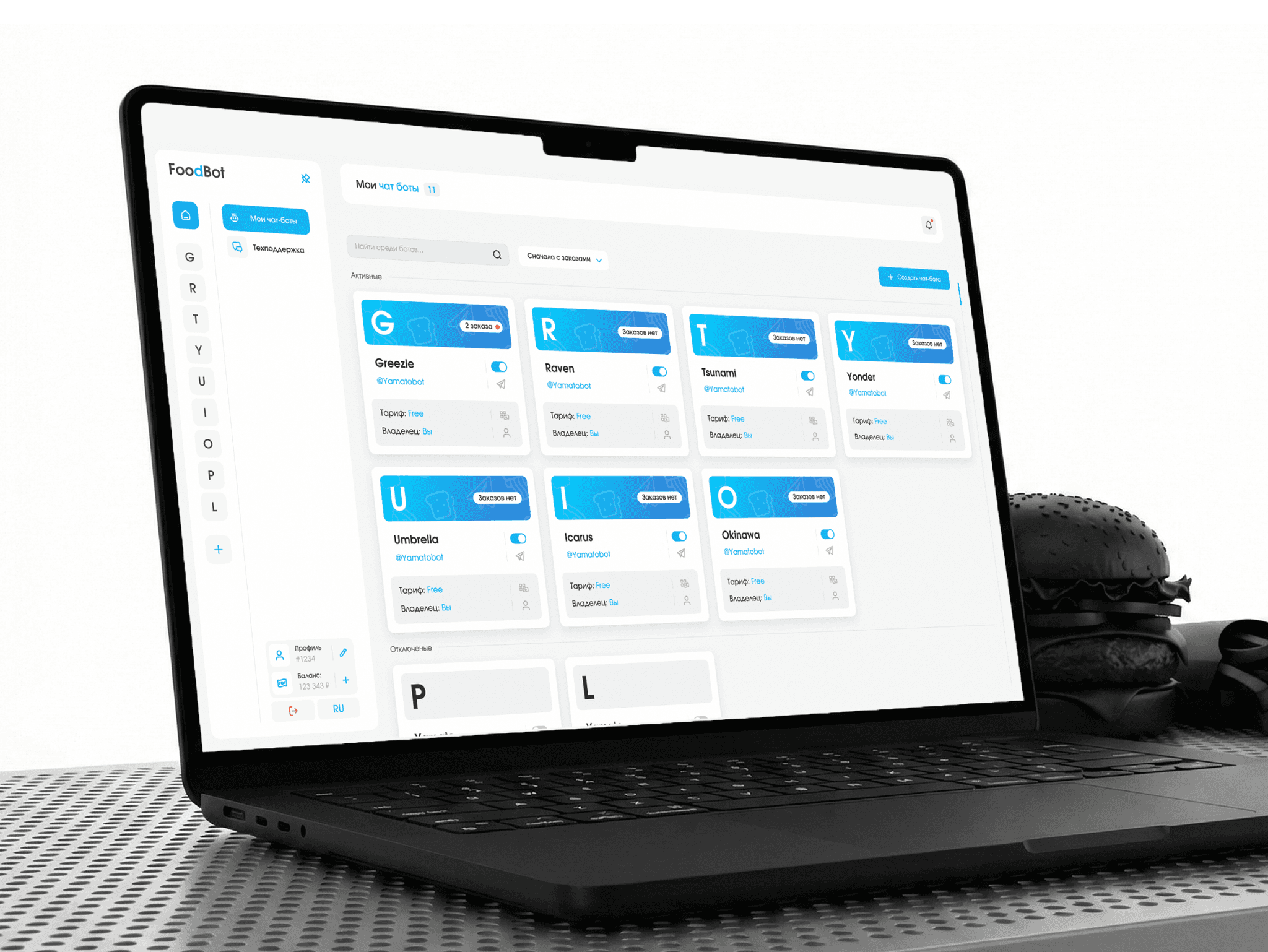
FoodBot is a service where cafés and restaurants launch their own Telegram bot for delivery orders — no programmers needed.
in this case
-
Delivery management moved into Telegram.
Orders and the stop list — from a smartphone: 40% fewer missed orders. -
Five clear steps instead of one scary field.
25% fewer people give up halfway through setup. -
Why more features does not mean better.
Three options and why the interface that leads the way won. -
A blue that did not read on white.
How one check changed the main color.
 product design/b2b
Project at a glance
Role. The only designer on the team — the whole design was on me.
Timeline. 11 months.
Starting point. A redesign: the old dashboard did not get café owners to launch a bot.
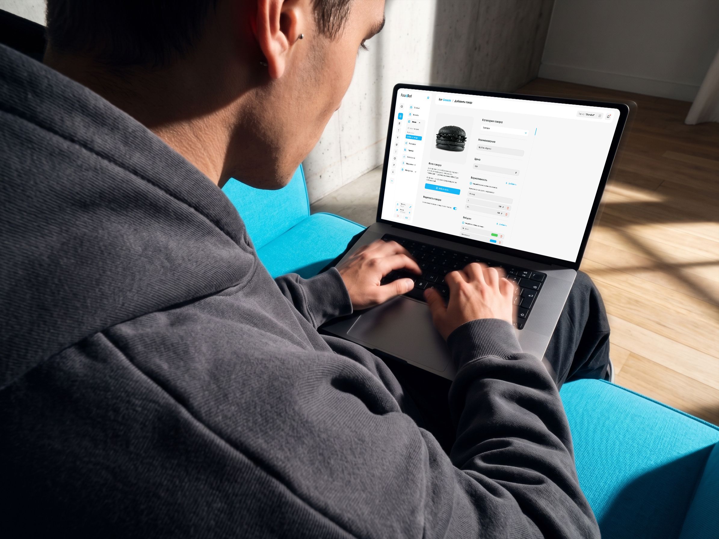
Outcome. A dashboard, a Telegram mini app and a landing page in one style.
The task
Make a dashboard where a café owner with no technical skills launches an order bot on their own — as easily as filling in a social media profile — and stops missing orders.
The client’s technical condition: the mobile dashboard runs inside Telegram as a mini app. Telegram has its own buttons and colors that follow the user’s theme, and with the keyboard open there is little room on the screen.
What I found out
Who uses it. Café owners are always on the move and miss orders because they do not see notifications. So management belongs on the phone.
What competitors do. Lots of features, but nobody tells you what to do next. So the dashboard must lead the way.
Which words scare people. “API token” and dozens of settings. So we speak plainly.
Three options and how I chose
I compared the options with three questions: will someone without technical skills figure it out, will orders stop getting lost, and is it expensive to build.
A — more features. Just more complicated.
B — training and support. The complexity stays; it just moves to support.
C — a dashboard that leads the way. A step-by-step guide, hints and management from Telegram.
I chose C. The downside: the mobile version in Telegram needed a lot of separate work. I showed the client that this is exactly what solves missed orders.
Where I was wrong and what I changed
A blue that did not read. The main blue on a white background turned out too pale — captions and links were hard to read, especially on a phone. A contrast check of the layouts showed this. I adjusted the shade — now everything reads, and the color is still recognizable.
A check without an expensive test. With an AI model I built a tool that shows where users look. It confirmed that attention follows the intended path.
What I did and why
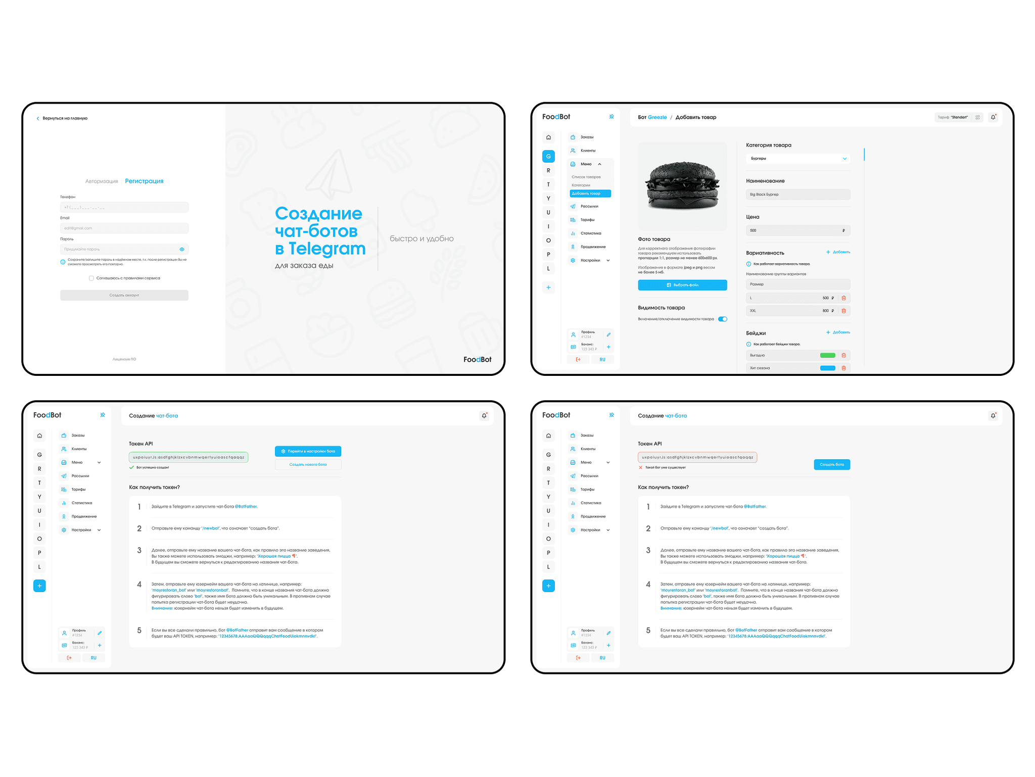
Connect in 5 steps. A simple step-by-step guide instead of one technical field.
Why: people do not get stuck at the very first step.
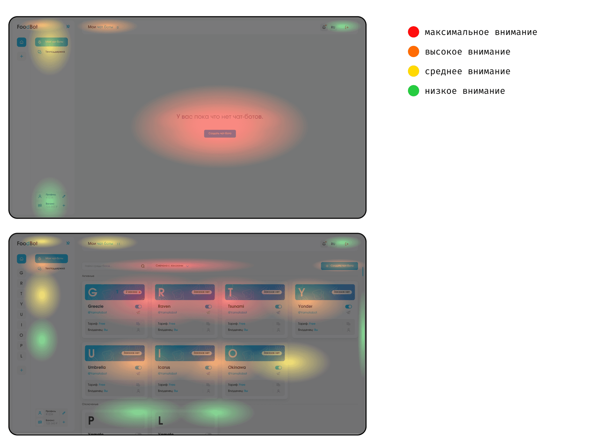
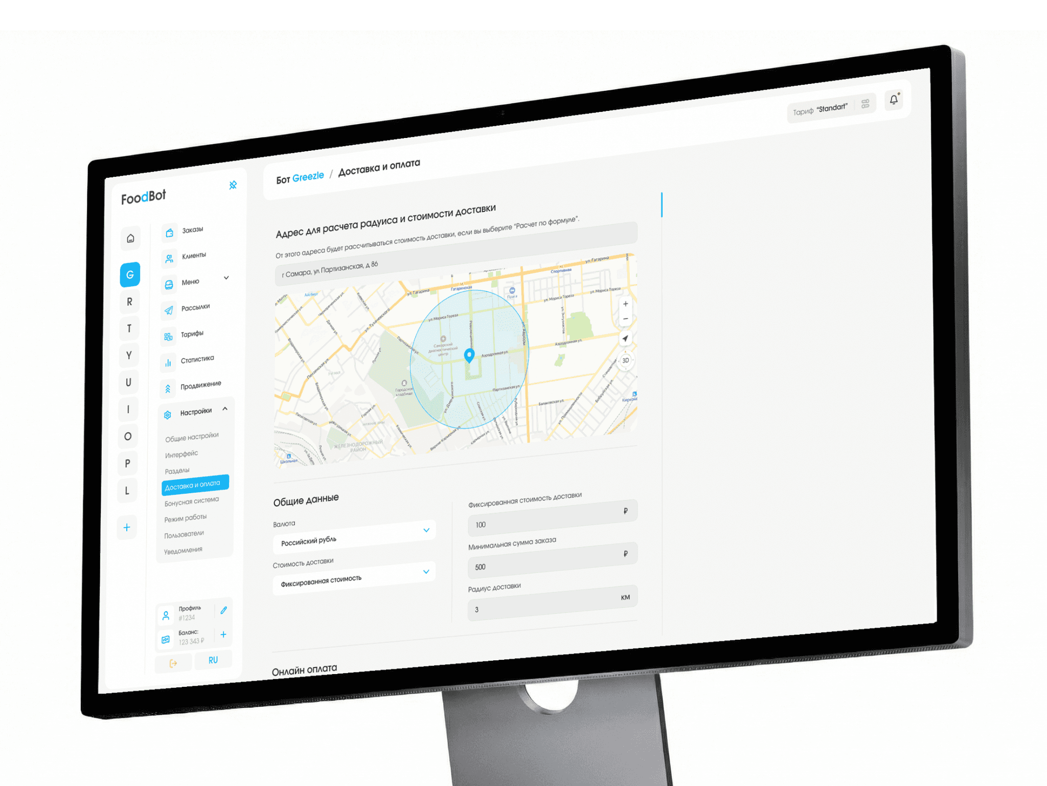
Screens for the situation. No bots yet — one “create” button. Once they exist — a list, filters and search.
Why: newcomers know where to start, experienced users manage easily.
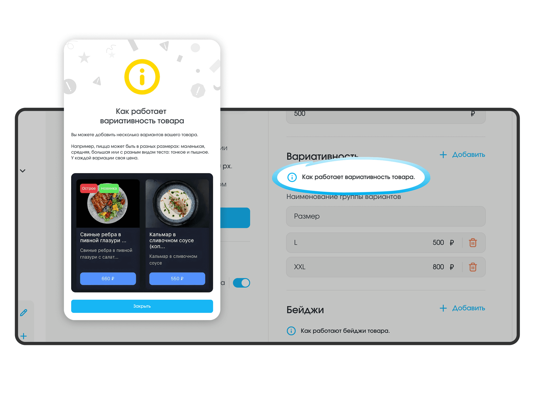
Hints. Next to tricky settings — an explanation with an example.
Why: no need to write to support — the answer is already on screen.
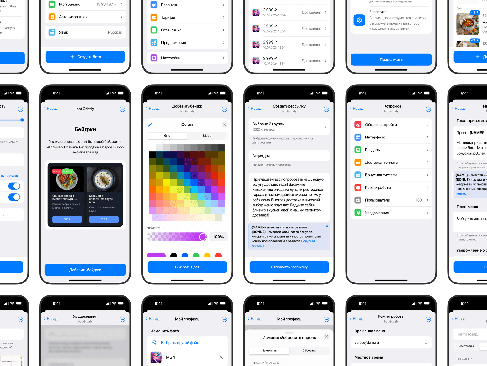
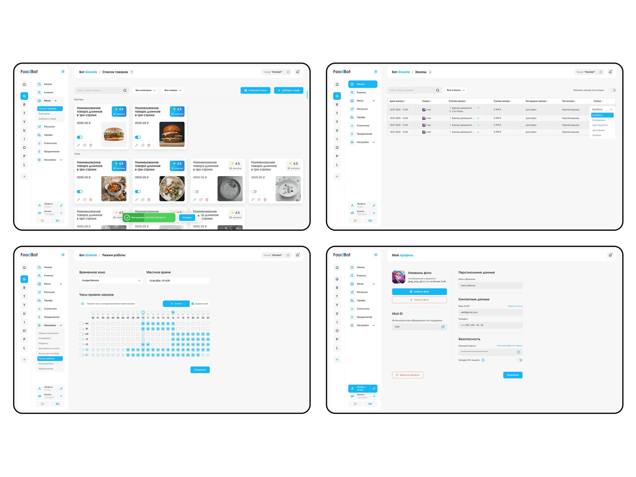
Management in Telegram. Orders, prices and the stop list — from a smartphone. To fit Telegram’s conditions, the screens are built from its native elements: familiar buttons, colors that follow the user’s theme, short forms above the keyboard.
Why: orders arrive where the owner already spends the day.
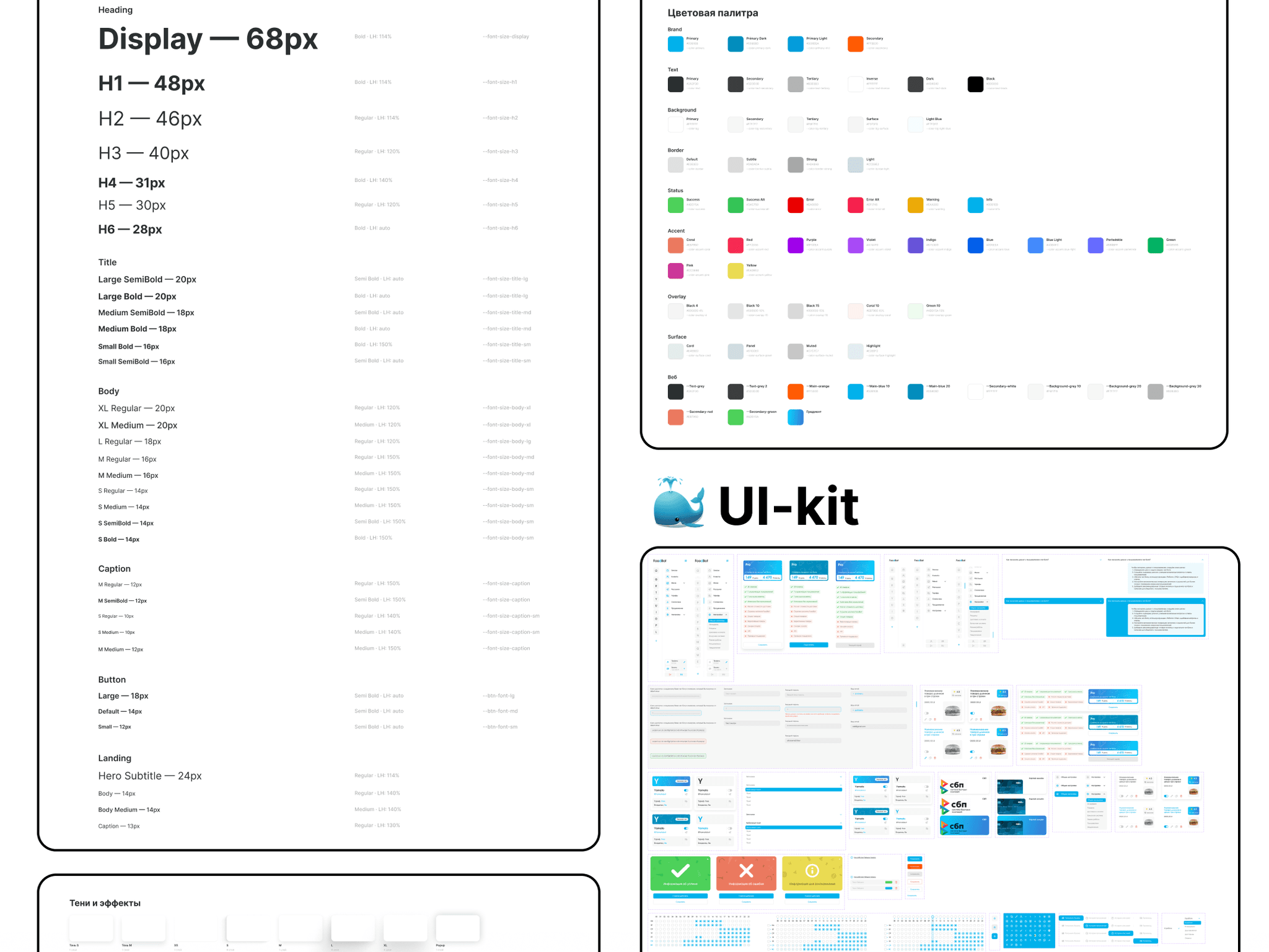
Defending the design and the developer handoff
I showed the client the path from café owners’ problems to the decisions. The main thing I defended was the mobile version in Telegram: expensive, but it is what brings back lost orders.
I gave the developers a tidy file: the dashboard, mini app and landing page in one design system — new sections are added quickly.
How I work. For eleven months I was the only designer, so I explained every decision through the business goal.
Results
What became easier in the product
Connecting in 5 steps: 25% fewer drop-offs.
Hints: setup is 30% faster, with 20% fewer support requests.
Management in Telegram: 40% fewer missed orders.
One design system: new sections are developed 20% faster.
How the product explains itself
Plain language instead of technical terms.
Feels like a familiar builder, not a complex database.
The menu as cards — the way a guest will see it.
How AI helped
Claude — collecting and analyzing data. Competitors’ reviews and documentation — café owners’ main problems. Far more sources, so the findings are more accurate. 5 minutes instead of a whole day of manual search.
My own tool. Shows where users look — a check without an expensive test.
Claude — analyzing product metrics. 2 minutes instead of 2 hours in Excel.
Claude + Figma Agent — preparing the file for developers. Styles, layer names, versions for different screens, the design system, checks for missing screens and user-flow logic. 1 hour instead of 16 hours of work.
AI saves time; the decisions are mine.