
vici
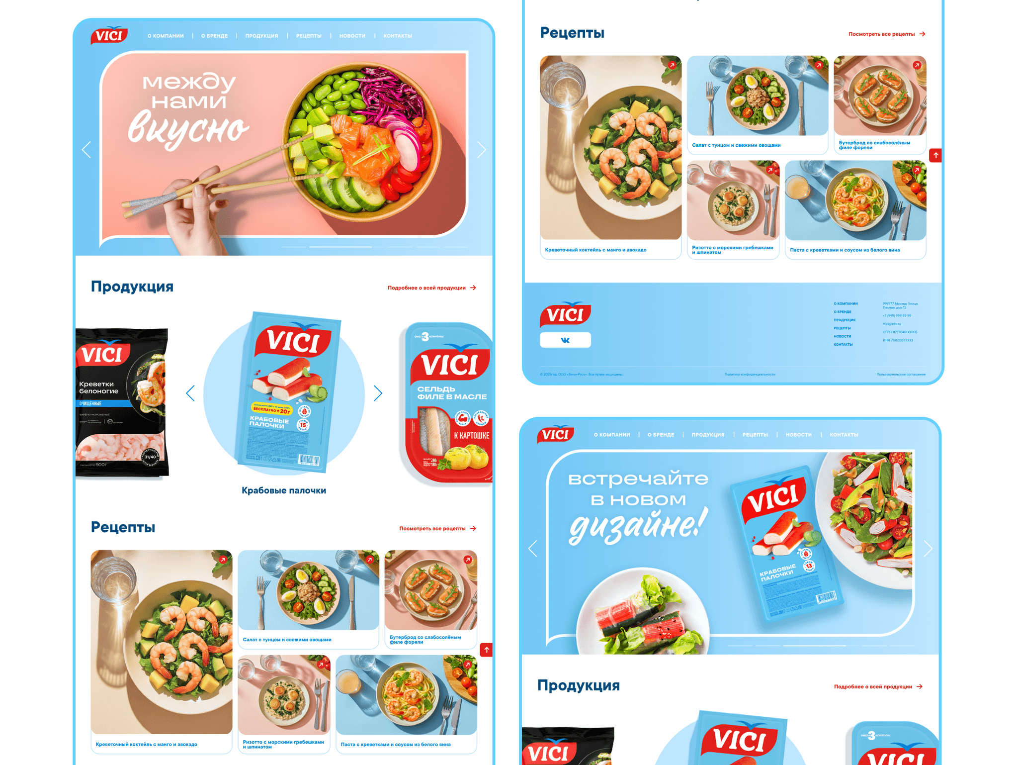
VICI is a major producer of fish and seafood, famous for its crab sticks.
in this case
-
The site became a cooking magazine.
From a recipe to a product, from a product to a recipe. -
A site with no cart that still sells.
How to tell the site helps sales in stores. -
Why a pretty showcase was not enough.
Three options and how I chose. -
In the first version, a recipe led nowhere.
How I found a dead end in my own layout.
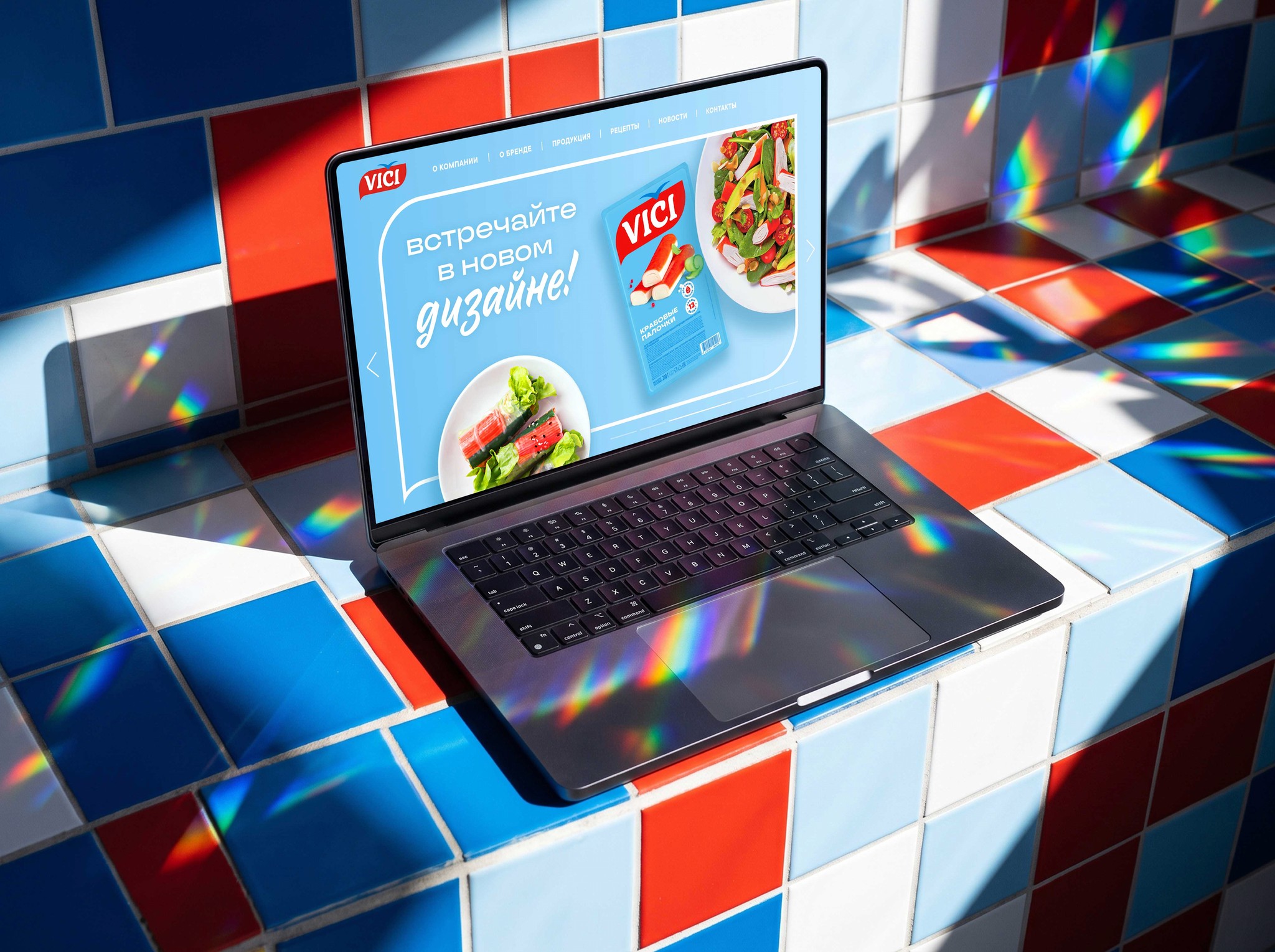 web-design
Project at a glance
Role. The only designer on the team.
Timeline. 4 months.
Starting point. A redesign after a rebrand: the old site did not help sell the products.
Outcome. A new site for all devices where recipes and products are linked to each other.
The task
Make a new site in the refreshed brand style where people spend more time and then buy the products in a store. The site has no cart — it sells through ideas.
The client’s technical condition: pages must open quickly over mobile internet right in the store, so no heavy video or animation.
What I found out
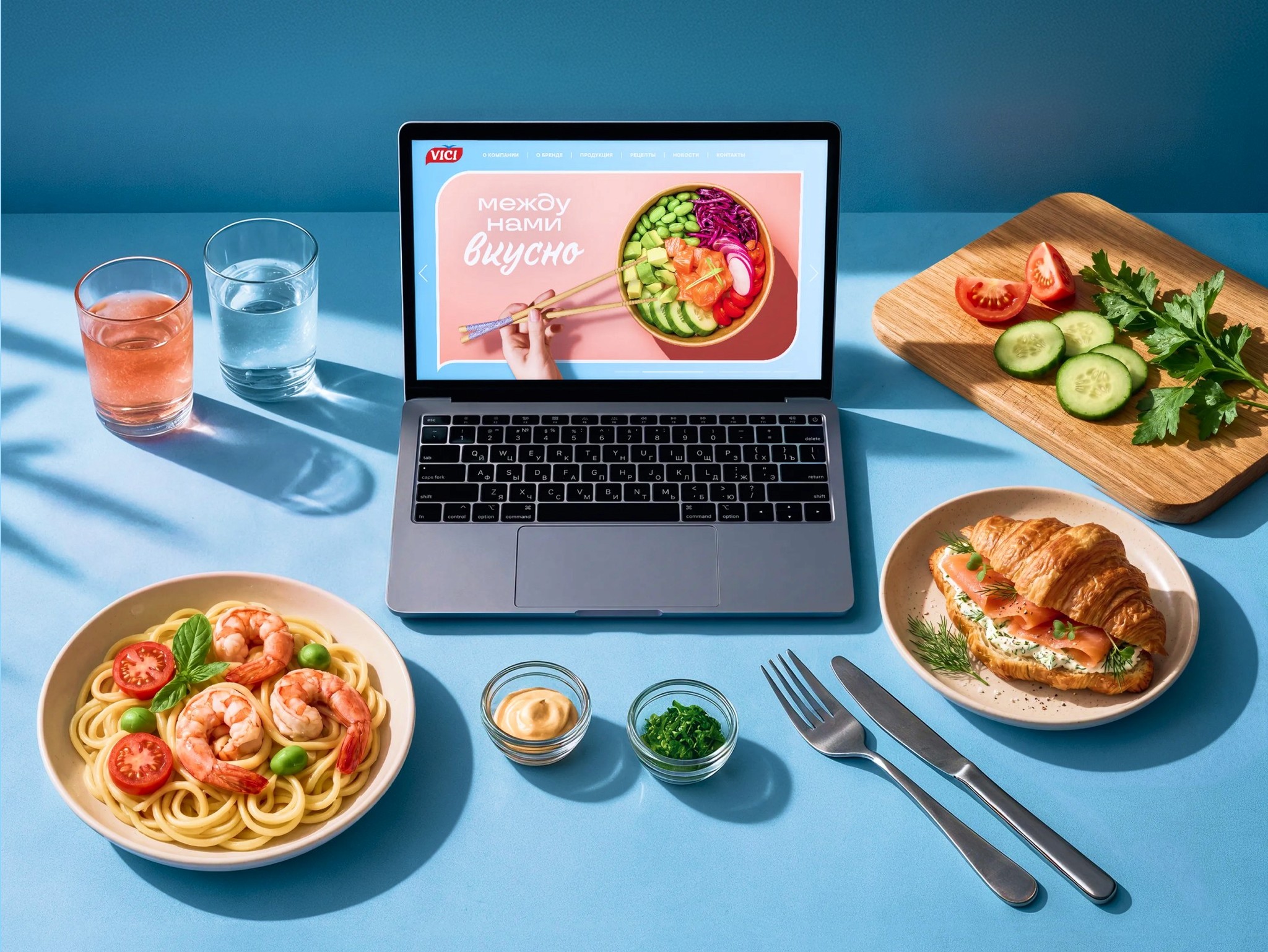
Why people come. Not for fish specs but for an idea of what to cook. So the site is a cooking magazine.
Where the dead ends are. On the old site products and recipes lived separately — people hit a dead end and left.
Where they visit from. Often from a phone right at the shelf. So everything must be easy one-handed.
Three options and how I chose
I compared the options with three questions: will people stay longer, will they get to a purchase in the store, and is it convenient on a phone.
A — a beautiful catalog. More modern, but the dead ends remain.
B — a separate recipe blog. Inspiring, but it does not lead to a product.
C — a magazine where recipes and products are linked. Inspiration turns straight into a shopping plan.
I chose C — only it both keeps people on the site and leads them to the shelf.
Where I was wrong and what I changed
A recipe that led nowhere. In the first version I kept the old structure: products separate, recipes separate. When I walked the shopper path “looking for a dinner idea → figuring out what to buy” through the prototype, it broke off at the end of a recipe. That is how the links between recipes and products appeared — the project’s key decision.
A blue that did not read. The brand blue on a white background was too pale for text — a contrast check showed this. I adjusted the shade for text and kept the color’s character in large accents.
What I did and why
Products and recipes are linked. The product card has “What to cook with it”, the recipe has “Ingredients from VICI”.
Why: people leave with a dinner plan and know which pack to look for.
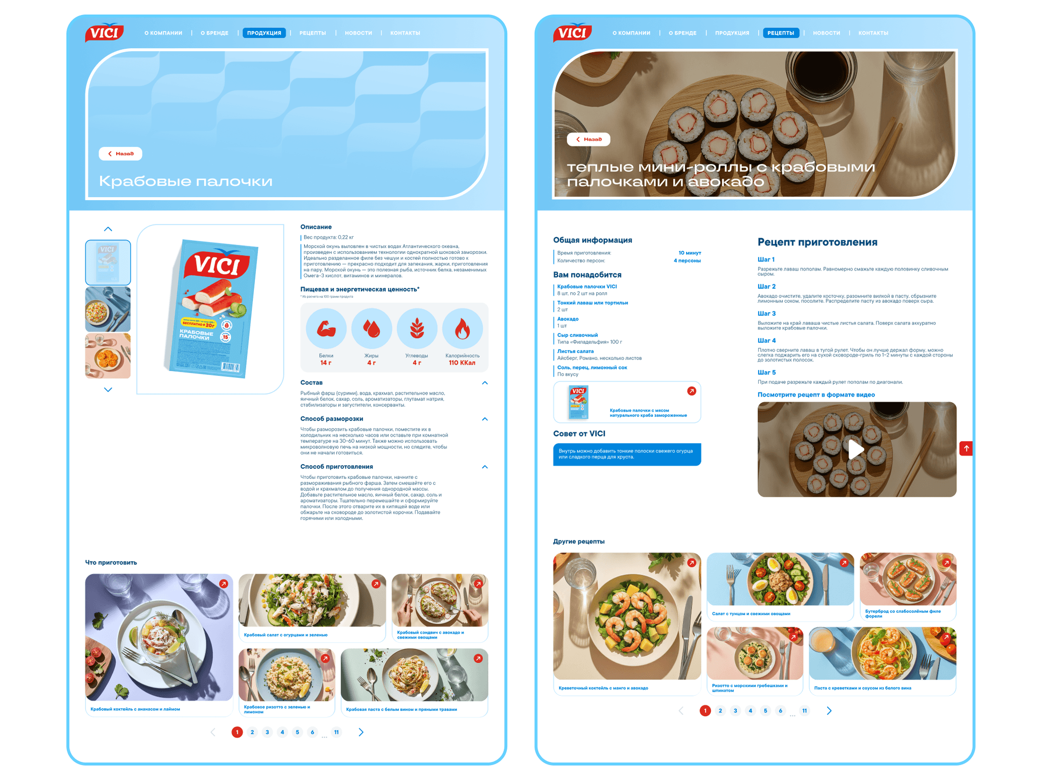
Similar recipes. After a recipe the site suggests the next one.
Why: there is always somewhere to go next.
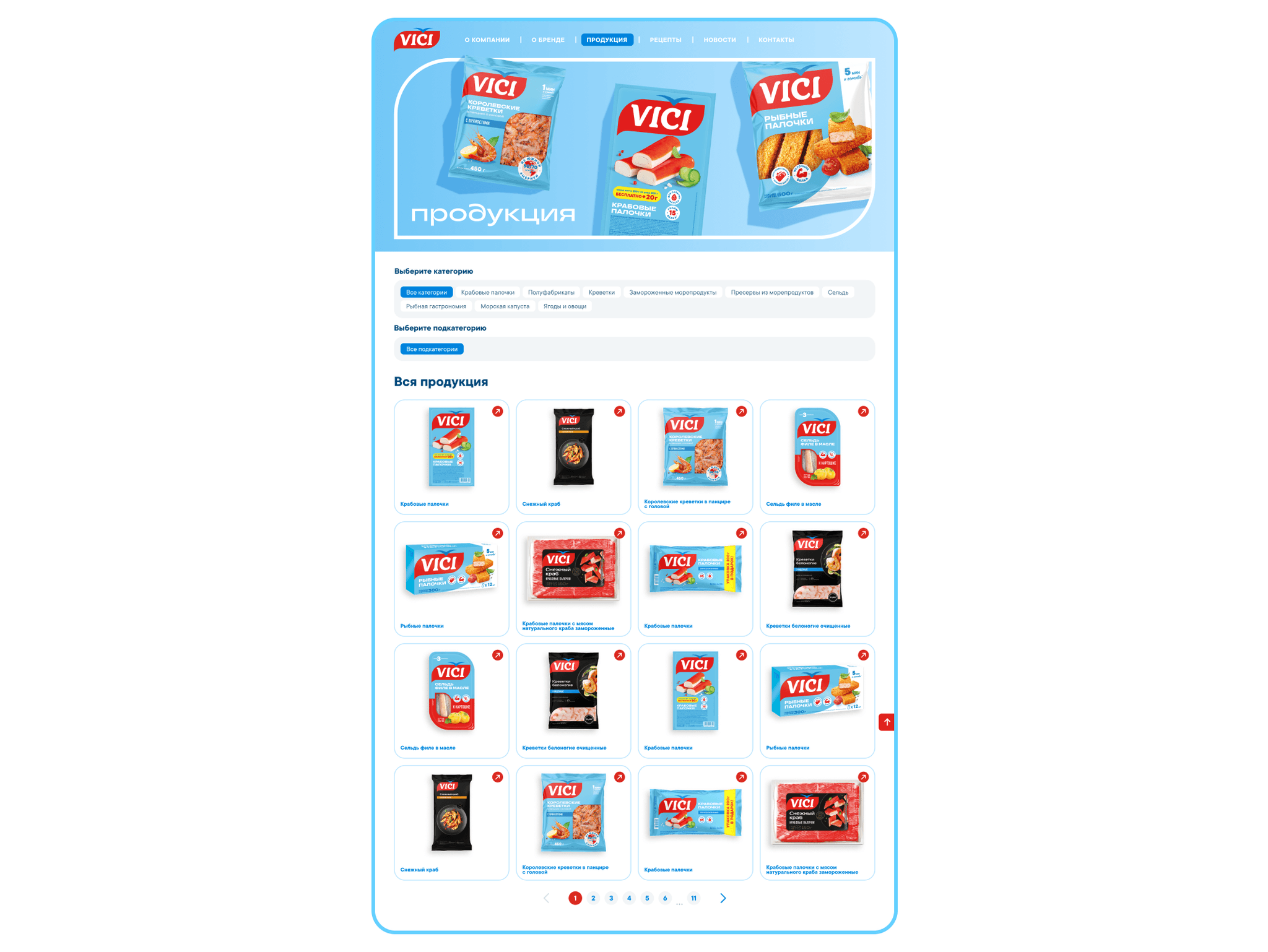
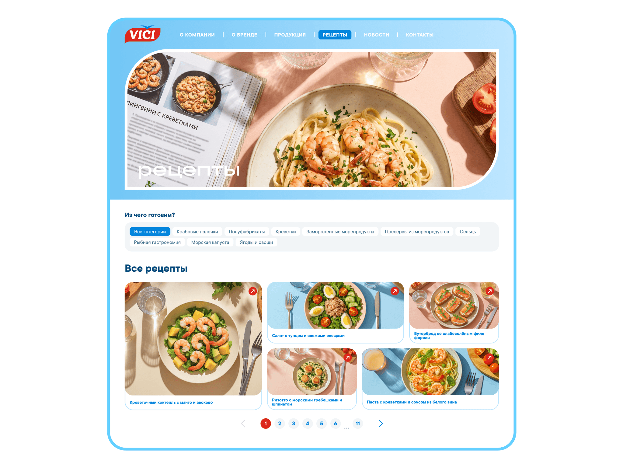
“Quick”, “For breakfast”, “Seafood” tags. In recipes and products.
Why: the right thing is found right away.
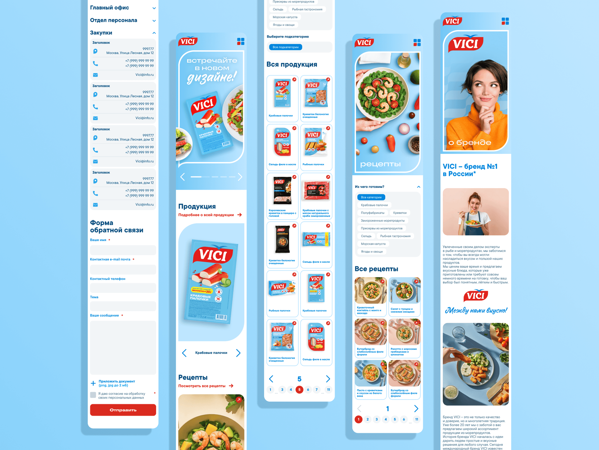
A mobile version for the shopper at the shelf. Large buttons and a recipe that is easy to scroll one-handed. So pages open fast in the store, the beauty comes from photos and type, not video.
Why: the site helps right at the shelf, like a cookbook in your pocket.
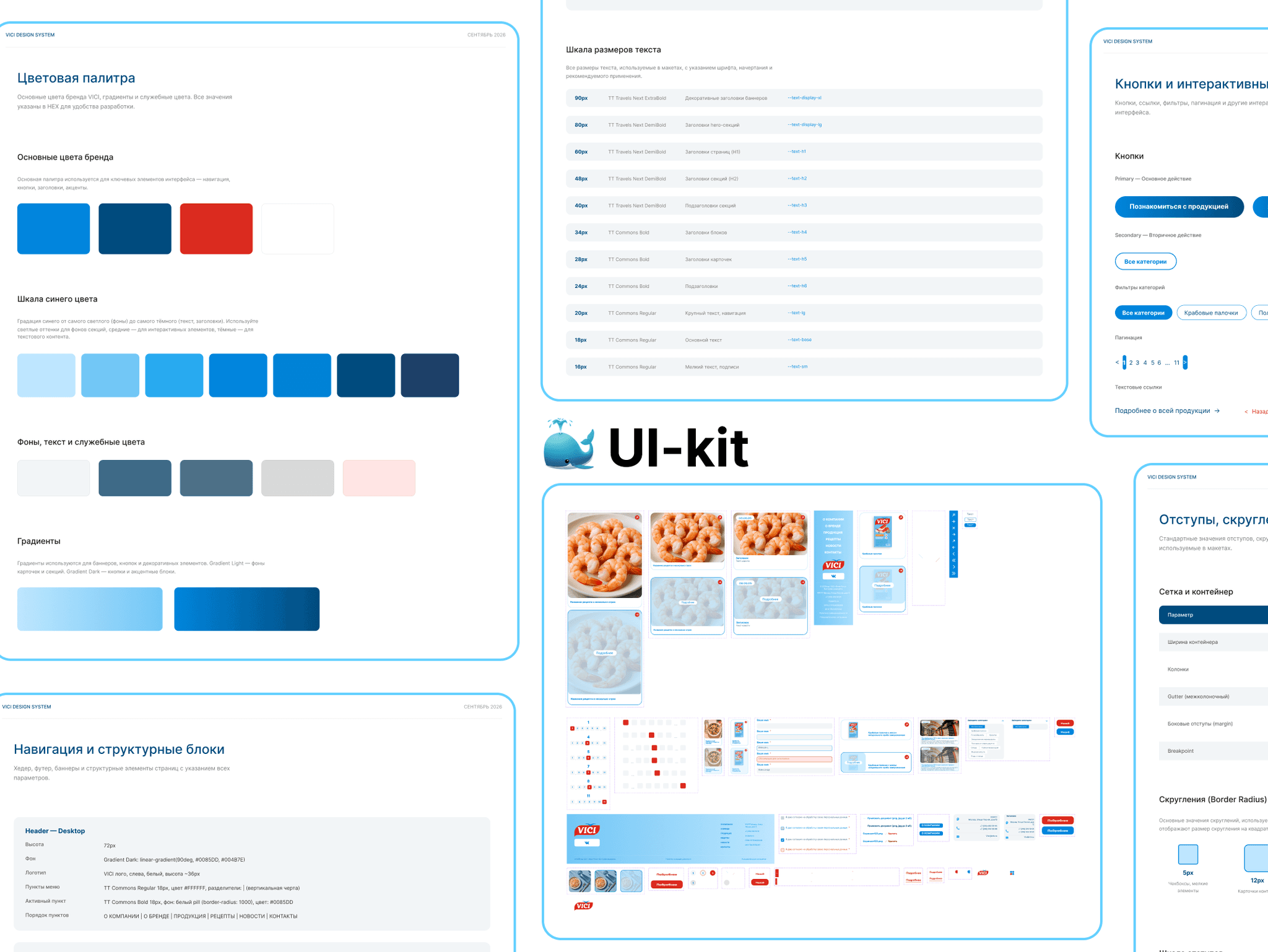
Defending the design and the developer handoff
The client’s main question was how to tell whether a site without a cart helps sales. The answer: we look at how many people go from recipes to products, how many pages they view and whether they come back from their phone.
I gave the developers tidy layouts and a ready map of which recipe leads to which product.
How I work. When the prototype showed a dead end in my own first version, I reworked the structure instead of defending the convenient solution.
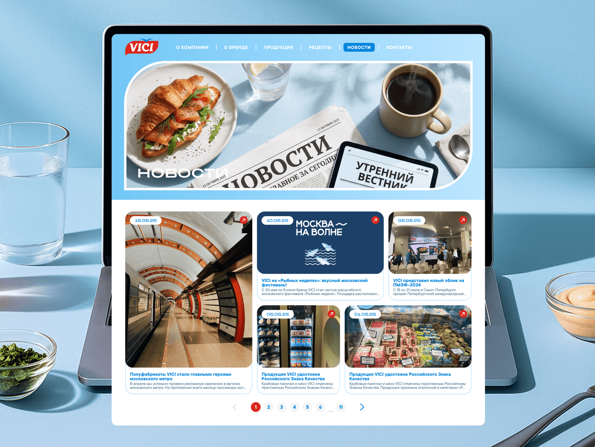
Results
I do not have post-launch numbers yet, so I describe what I changed and what it should affect.
What became easier on the site
No dead ends: from a recipe to a product and back. More people will find the right pack.
The next recipe is always close — people stay longer.
Tags — the right thing is found faster.
A light mobile version — quick and convenient right in the store.
How the site tells the brand’s story
It sells a dish, not a product — like a cooking magazine.
The brand’s products are visible in every recipe.
A light, modern style helps move away from the “cheap frozen food” image.
How AI helped
Claude — collecting and analyzing data. Reviews, search queries and recipe-to-product links. Far more sources, so the findings are more accurate. 5 minutes instead of a whole day of manual search.
Claude + Figma Agent — preparing the file for developers. Styles, layer names, versions for different screens, the design system, checks for missing screens and user-flow logic. 1 hour instead of 16 hours of work.
AI saves time; the decisions are mine.