
vici
VICI is a large food company and one of Europe’s leading producers of fish and seafood.
The brand is best known for its crab sticks made from surimi — its signature product. For decades the red packs with the VICI logo were the most popular product in this category across the post-Soviet countries.
in this case
-
The catalog became a cooking magazine.
A “product ↔ recipe” loop: from a dinner idea to the pack on the shelf. -
A site with no cart that still sells.
How to measure the site’s value for offline sales. -
Why a showcase redesign did not solve the main problem — dead ends.
Three options and the selection criteria. -
In the first version, a recipe led nowhere.
How walking a shopper’s scenario through the prototype found a dead end.
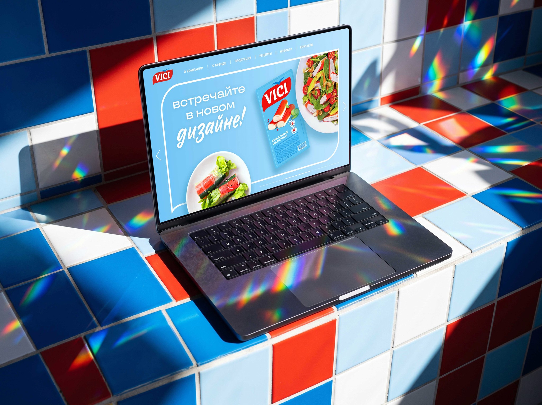 web-design
Project at a glance
Role. The only designer on the team, responsible for the entire website design.
Timeline. 4 months.
Starting point. A redesign after a rebrand: the previous website did not lead people to buy the brand’s products.
What I did. Research, information architecture, layouts for all devices, the design system and a map of links between recipes and products.
Outcome. A website on the brand’s new design code for all devices and a ready content-link map for development.
Task and constraints
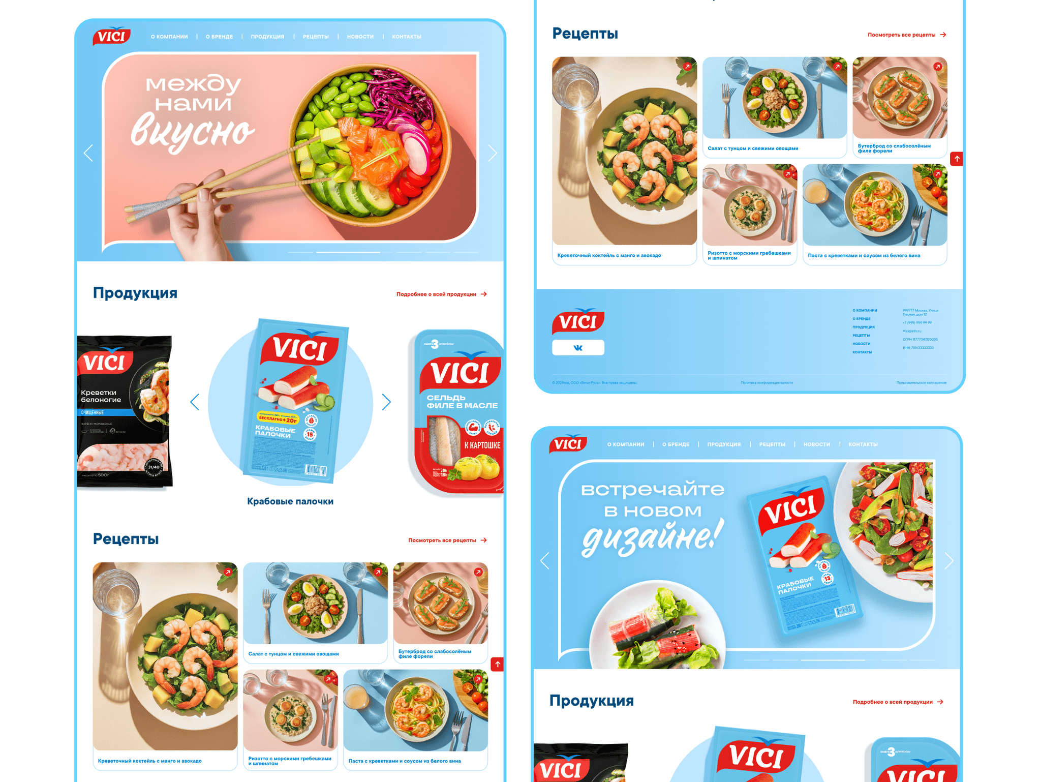
Design a minimalist website based on the brand’s new design code and adapt it to all devices.
Business goal: increase time on site and build deferred demand — the wish to buy the products in a physical store. The site has no cart, so it has to sell through shopper behavior.
Technical constraint from the client: pages must open quickly over mobile internet right in the store, where the connection is often weak. The client limited page weight — no heavy video or animation.
What I found out
Consumption patterns. People rarely look up herring or shrimp specs on a manufacturer’s site — they need to decide what to cook for dinner or a celebration. Takeaway: sell not the raw product but the result — a dish; the site works as a cooking magazine, not a warehouse showcase.
The old site map. “Products” and “Recipes” lived separately: from the fish catalog people hit a dead end and left. Takeaway: we need circular cross-linking — the catalog suggests recipes, and a recipe leads to the brand’s products.
Context. People often check the site on their phone while standing at the shelf. Takeaway: the mobile version must be one-hand friendly.
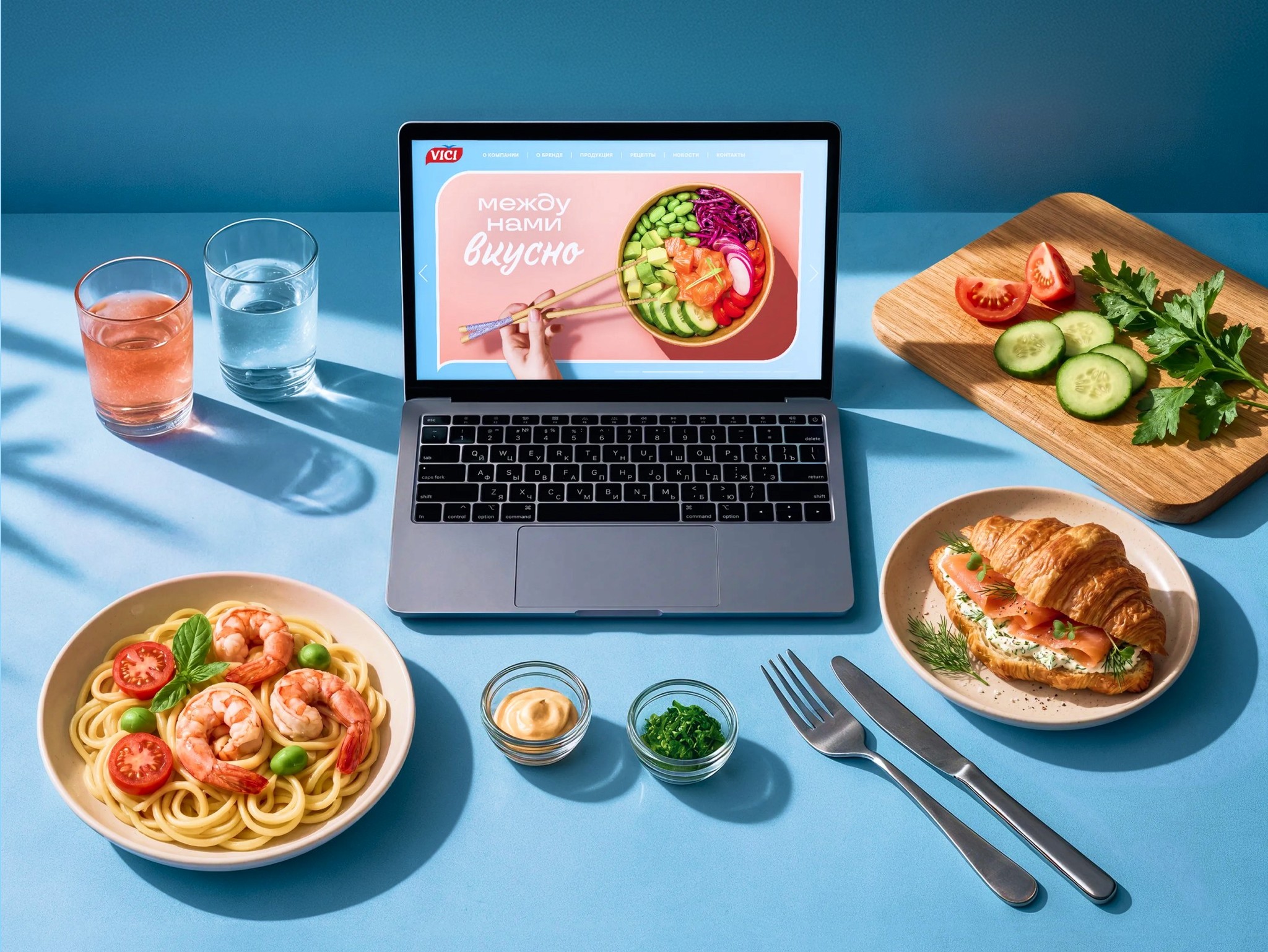
Three options and how I chose
I compared the options on three criteria: does it grow time on site, does it lead to a purchase at the shelf, and is it convenient on a phone in a store.
A — a beautiful catalog. Refresh the showcase with the new design code. The site becomes more modern, but the dead ends remain.
B — a separate recipe blog. Content attracts traffic, but if it does not lead to products, inspiration does not turn into a purchase.
C — a cooking magazine with a “product ↔ recipe” loop. The user journey is built around recipes with seamless links between inspiration and a specific product.
I chose C: only it both grows time on site and turns it into a purchase at the shelf. The risk: for a manufacturer it changes the site’s role from showcase to magazine; I defended this to the client.
Where I was wrong and what I changed
A recipe that led nowhere. In the first version of the layouts I focused on the new design code and kept the old site’s structure: products and recipes lived separately. When I built a prototype and walked through the shopper scenario “looking for a dinner idea → figuring out what to buy”, the path broke off at the end of a recipe — you could not go from a dish to a product, or from a product card to an idea of what to cook with it.
That is how the two-way link between the catalog and recipes, and the recommendations at the end of a recipe, appeared — the project’s key decision.
A blue that did not read on white. The brand blue from the new design code was not contrasting enough on white for text and links — a contrast check of the layouts showed this. I adjusted the shade for text elements and kept the color’s character in large accents.
Decisions and what they target
A two-way link between catalog and recipes. The product card has a “What to cook with it” block with recipes. The recipe page has “Ingredients from VICI” linking to the product card.
Targets: clicks from recipes to products — people leave with a specific pack in mind. The cross-linking also helps search ranking.
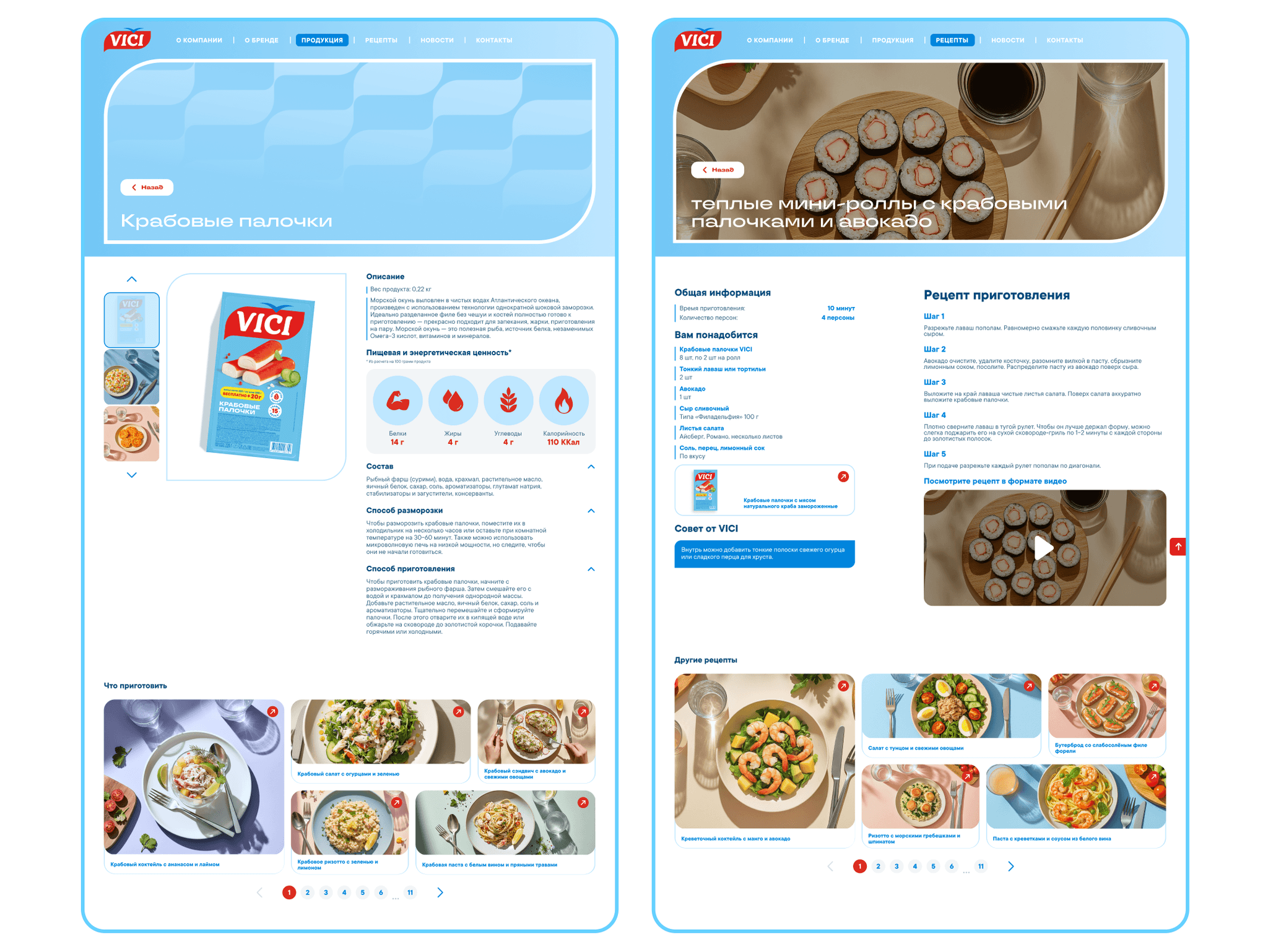
Recommendations at the end of a recipe. After a shrimp croissant recipe the site suggests other quick breakfasts.
Targets: there is always a next step — page depth and time on site grow.
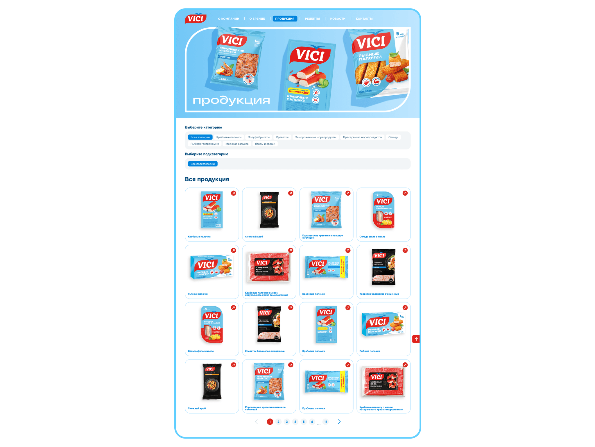
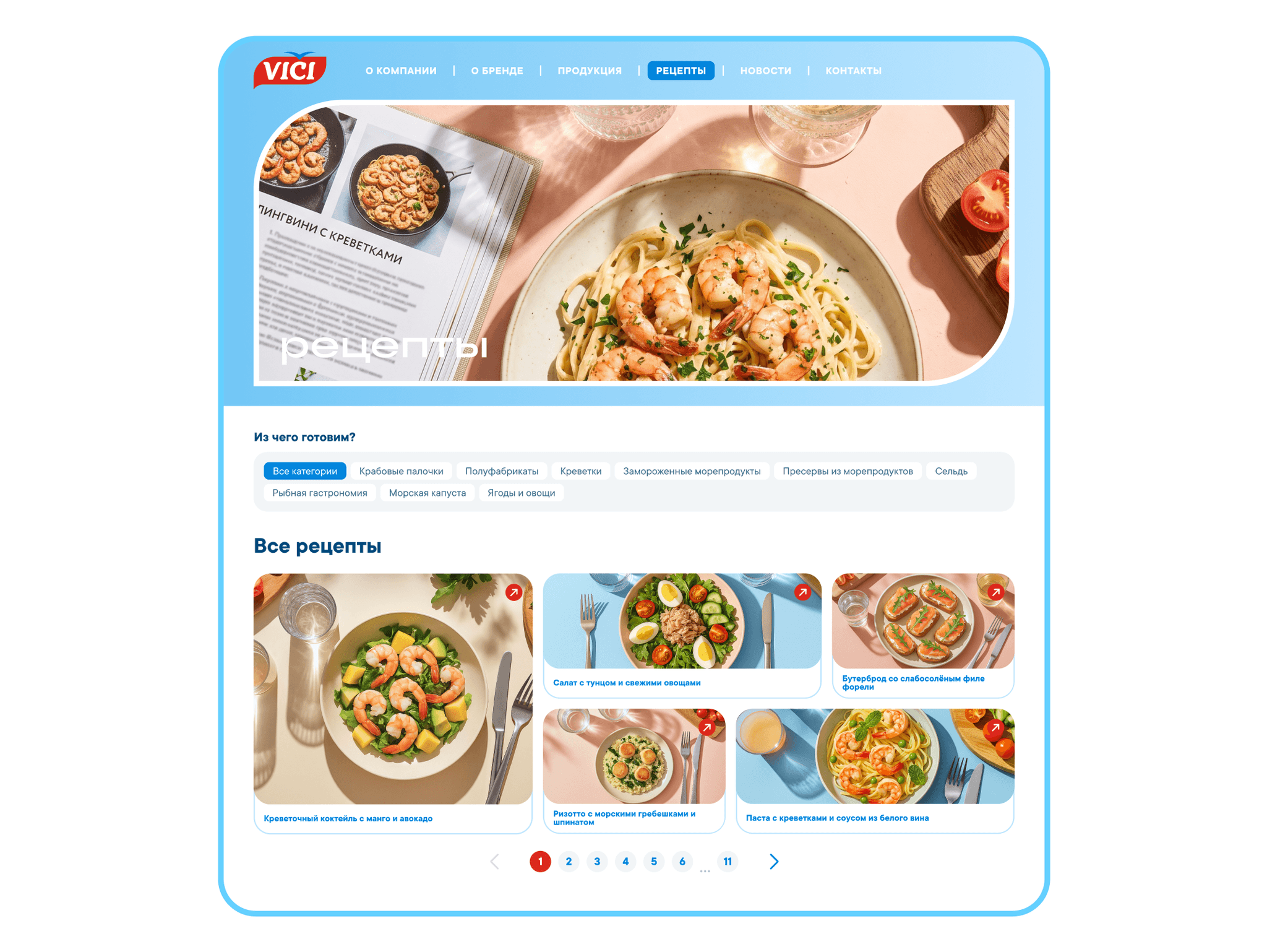
A tag system. “Quick”, “For breakfast”, “Seafood” — across recipes and products.
Targets: the right content is found immediately, without search — fewer bounces.
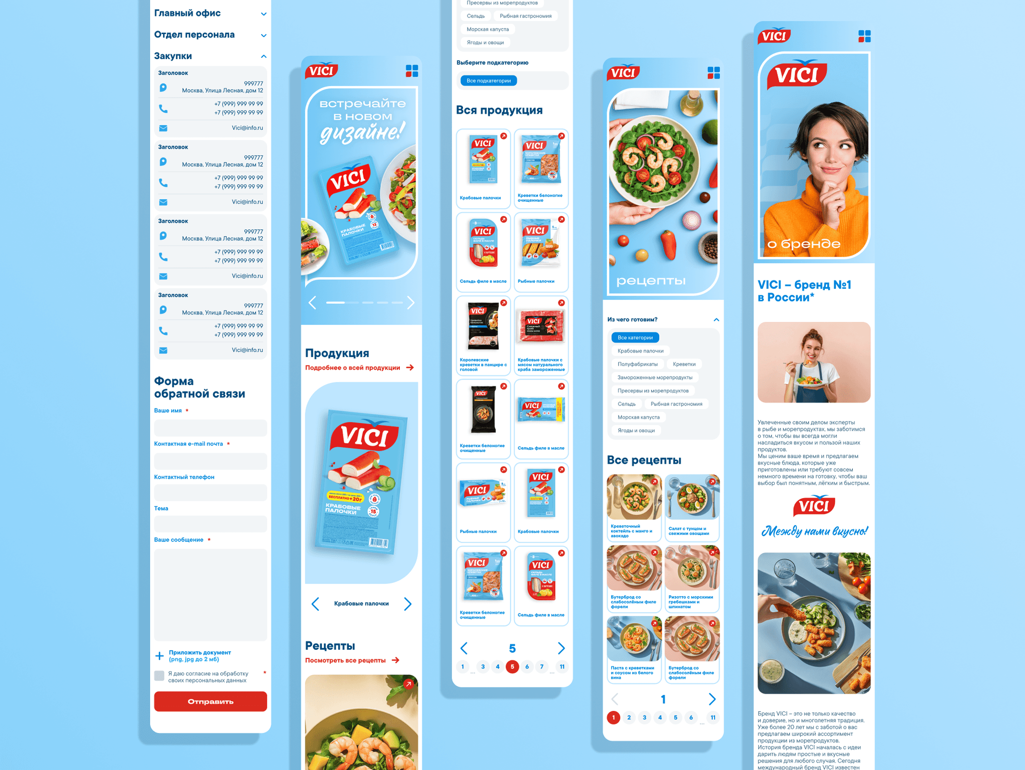
A mobile version for the shopper at the shelf. Larger tap targets, sticky navigation, and a step-by-step recipe that is easy to scroll one-handed without losing sight of the brand’s ingredients. How this answers the page-weight constraint: the food aesthetic comes from still photos and typography rather than video and animation; on a phone the recipe and ingredients load first, the rest as you scroll.
Targets: the site helps at the moment of choice in the store and becomes a “cookbook in your pocket” people come back to.
Defending the design and handoff
I showed the client the path from shopper behavior to the decisions.
How a site without a cart sells. The client’s main question was how to tell whether the site drives offline sales. My argument: we measure hidden conversion — clicks from recipes to product cards, page depth, time on site and repeat mobile visits. Recipes at the center, not the catalog. People come for a dinner idea, and that is what brings them to the shelf.
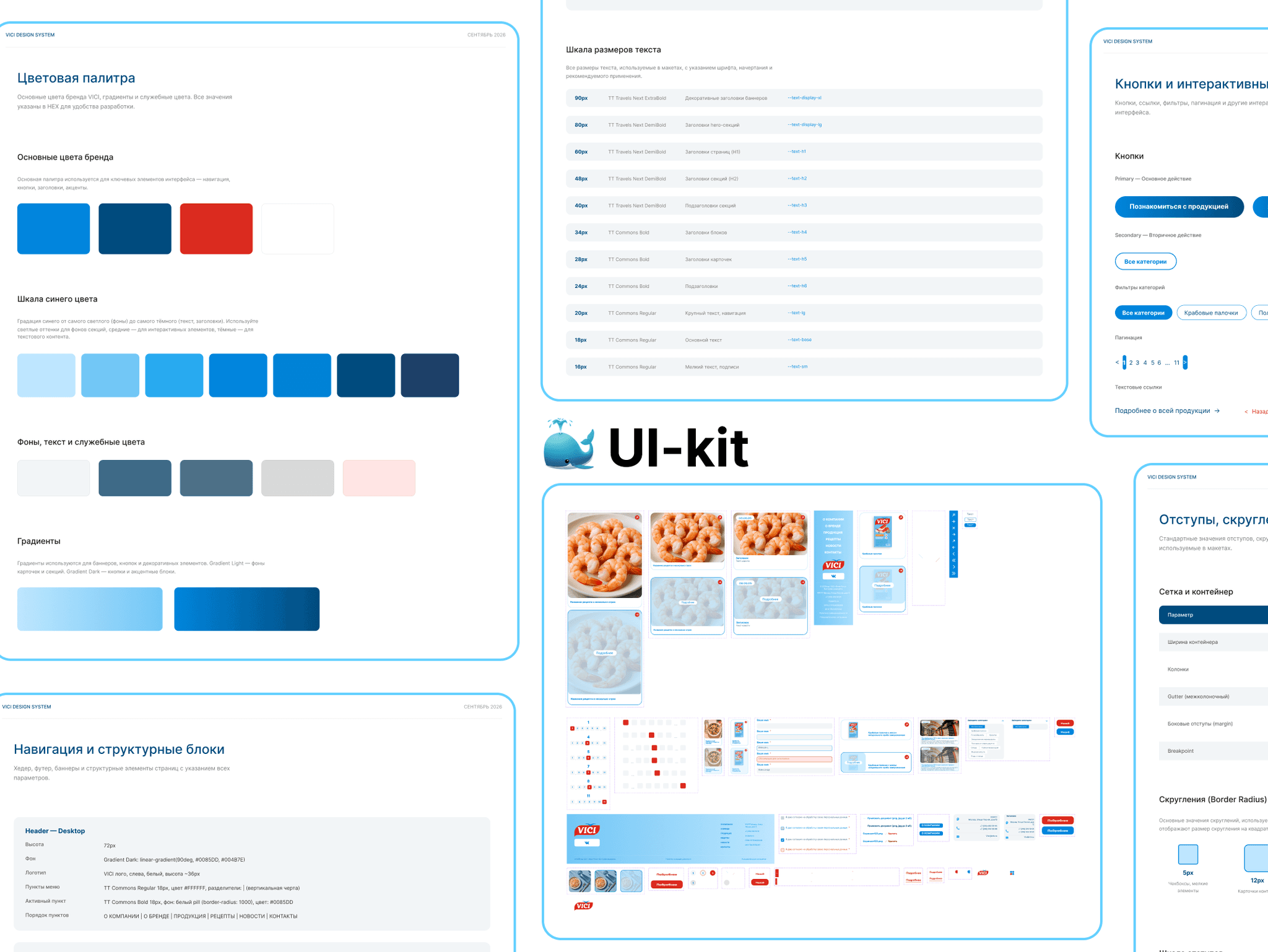
I handed over the layouts systematically: screens and states are built with Auto Layout and linked to a UI kit; animations are annotated. Along with the layouts the developers received a content-link map — which recipes lead to which products.
How I work. I did the redesign alone in four months; when the prototype revealed a dead end in my own first version, I reworked the structure instead of defending the convenient solution.
Results
The new site is live, but I do not have post-redesign numbers yet, so I describe what I changed and which metric each change targets.
Product — how the product works and how people use it
A “product ↔ recipe” loop instead of dead ends: from any recipe you can go to a product and back. Targets hidden conversion — clicks from recipes to product cards.
Recommendations at the end of a recipe: the session does not end on one page. Targets page depth and time on site.
Scenario tags: “quick”, “for breakfast”, “seafood”. Targets fewer bounces.
A light mobile version for the store: one-handed, loads fast over a weak connection. Targets repeat visits from phones.
Communication — how the product conveys its value
The brand sells a dish, not a product: the site speaks the language of a cooking magazine — dinner ideas, breakfasts, a festive table.
The brand’s ingredients are in sight in every recipe — people know which pack to look for on the shelf.
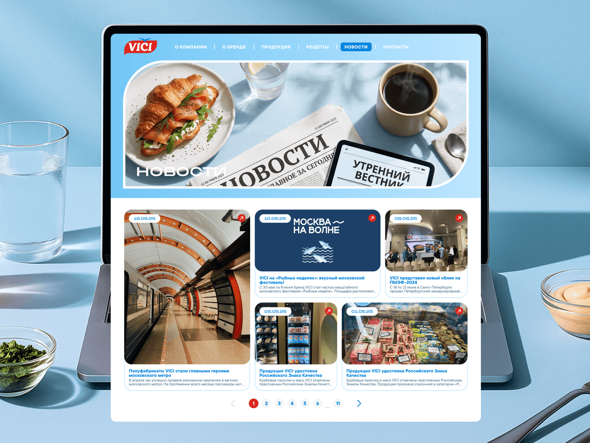
A new brand image: an airy minimalist UI and food aesthetics aim to move away from “cheap frozen food” associations and get closer to a younger audience.
Readability: after the blue fix, text and links read confidently on any screen.
How I used AI
Claude — collecting and analyzing data for the task. Customer reviews, frequent search queries and an audit of the old site architecture, then a recipe-to-product link matrix and a tag scheme. The main gain is quality: data used to come from a limited set of external sources, while Claude covers an incomparably wider range, so the findings rest on a fuller picture. ≈ 5 minutes instead of up to 24 hours of manual search — dozens of times faster.
Claude + Figma Agent — preparing for development. Styles, layer naming, responsive versions, the design system and components in every state, checking for missing screens and states, checking the user-flow logic and contrast, and developer comments. ≈ 1 hour with edits instead of 16 hours of solid work.
AI takes over data collection and routine work; the decisions are mine, and I check them.