
my tiger
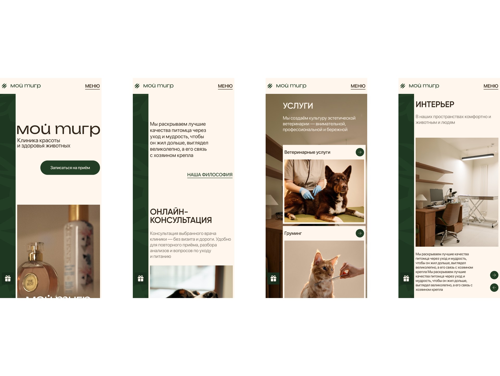
“My Tiger” is a premium pet clinic in Moscow: veterinary care and grooming. I built a separate landing page for it that brings in booking requests.
in this case
-
No discounts — and still a reason to book.
The clinic’s “Compliments” instead of crossed-out prices. -
A haircut that doubles as a health check.
Why the groomer and vet together are the main reason to book. -
Why we did not build a discount page.
Three concepts and how I chose. -
Booking got shorter after the review.
What we removed after walking through booking with the client.
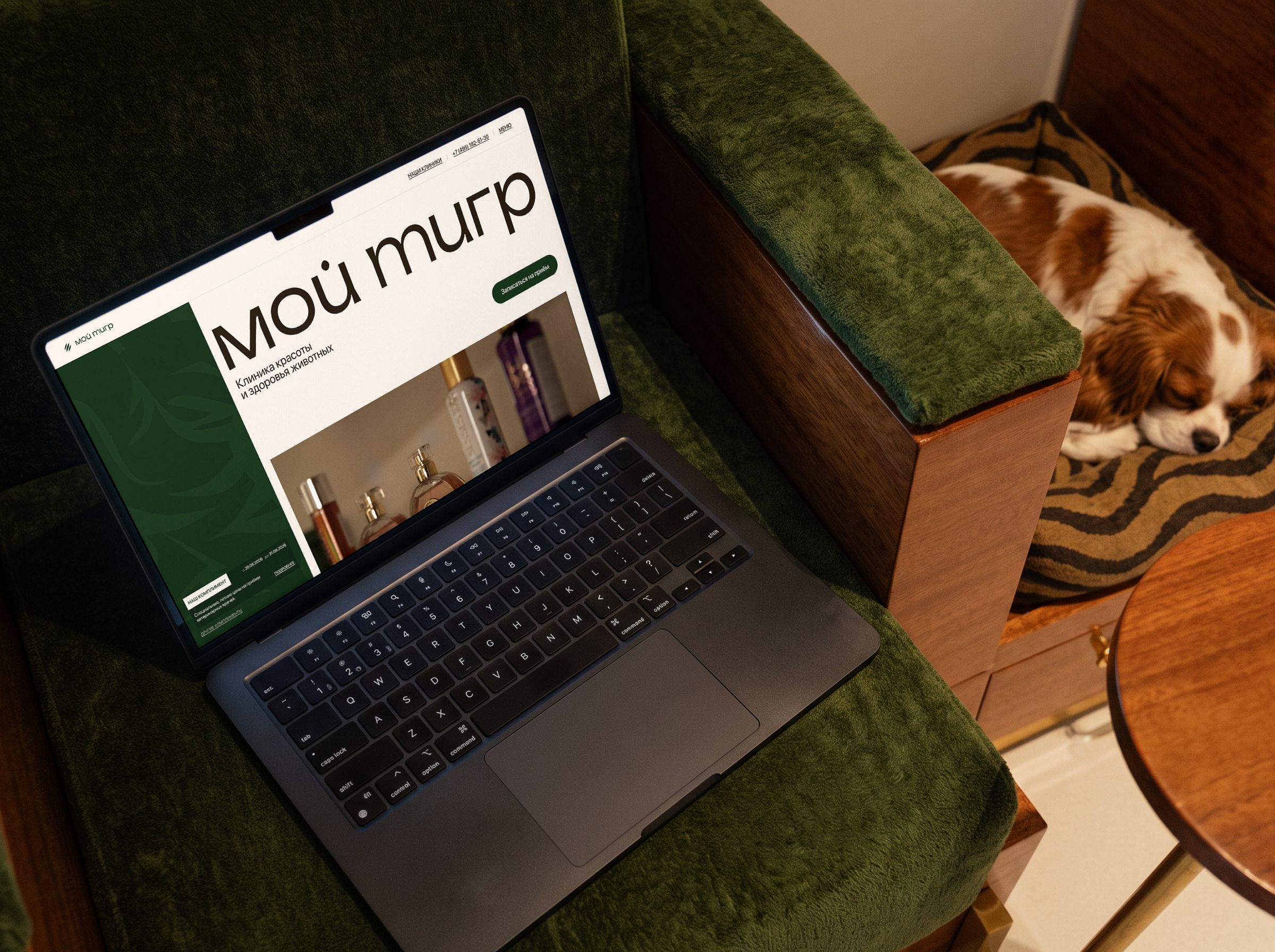 web-design
Project at a glance
Role. The only designer on the team.
Timeline. 2 months.
Starting point. A new page for ads — an alternative to the clinic’s main website.
Outcome. A landing page with easy booking and a working prototype where the client saw everything before development.
The task
Make a page that brings appointment and grooming bookings from ads — in the clinic’s premium brand style with real photos. Show that grooming here is health care, not just a haircut.
The client’s technical condition: the clinic’s system does not show vets’ free time publicly, so you cannot pick an exact time on the page — an administrator handles the request.
What I found out
People choose by trust. For owners a pet is family; what matters most is who will work with it and how. So we show the people and the place right away.
Grooming is sold as a haircut. Here the groomer works together with a vet. That is the key difference.
Discounts cheapen. A premium clinic needs special offers without crossed-out prices.
People arrive in different ways. For a service, a vet, a special offer or a consultation. Every path should lead to a short request.
Three concepts and how I chose
I compared the concepts with three questions: does it build trust, does it keep the clinic’s status, and can it be fairly compared with the site.
A — a discount page. There will be requests, but from the wrong people.
B — a short copy of the site. Safe, but nothing to compare.
C — trust and a short path. People, interiors, booking in a couple of steps and “Compliments” instead of discounts.
I chose C. Its boldest part is dropping discounts, which I defended to the client.
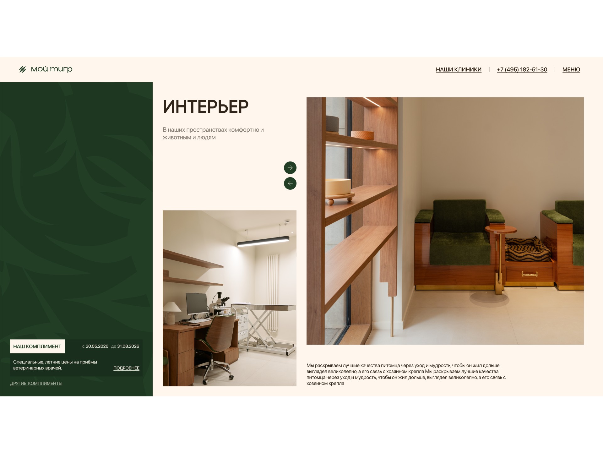
Where I was wrong and what I changed
Booking was longer than it needed to be. At first booking repeated the site’s logic: service → vet → clinic → form. At the review the client and I walked through it on the working prototype and saw the extra steps.
I removed the vet and clinic choice: after choosing a service, people go straight to the form. I made the online consultation a separate short path.
What I did and why
A clear first screen. Logo, who we are, a real photo and a “Book” button.
Why: in a couple of seconds you know where you are and what to do.
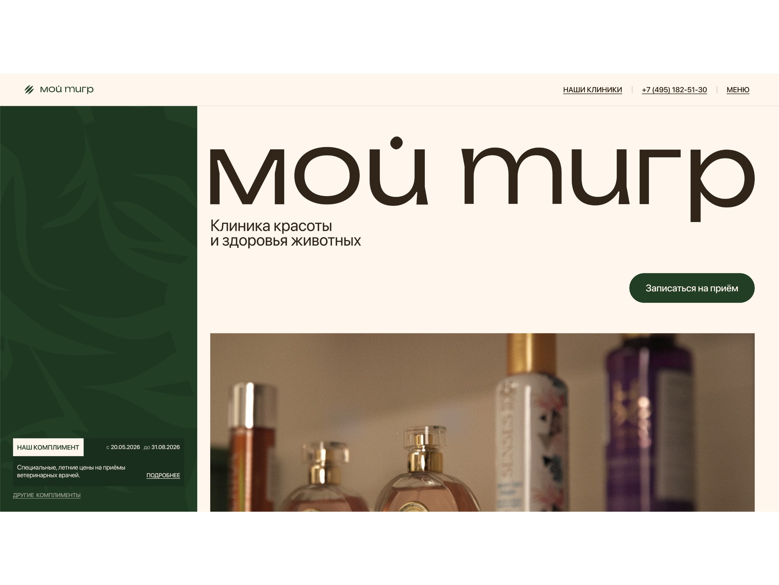
The “Compliment” panel always in view. A dark panel with the brand tiger stays put while scrolling.
Why: a reason to book is always close, without annoying banners.
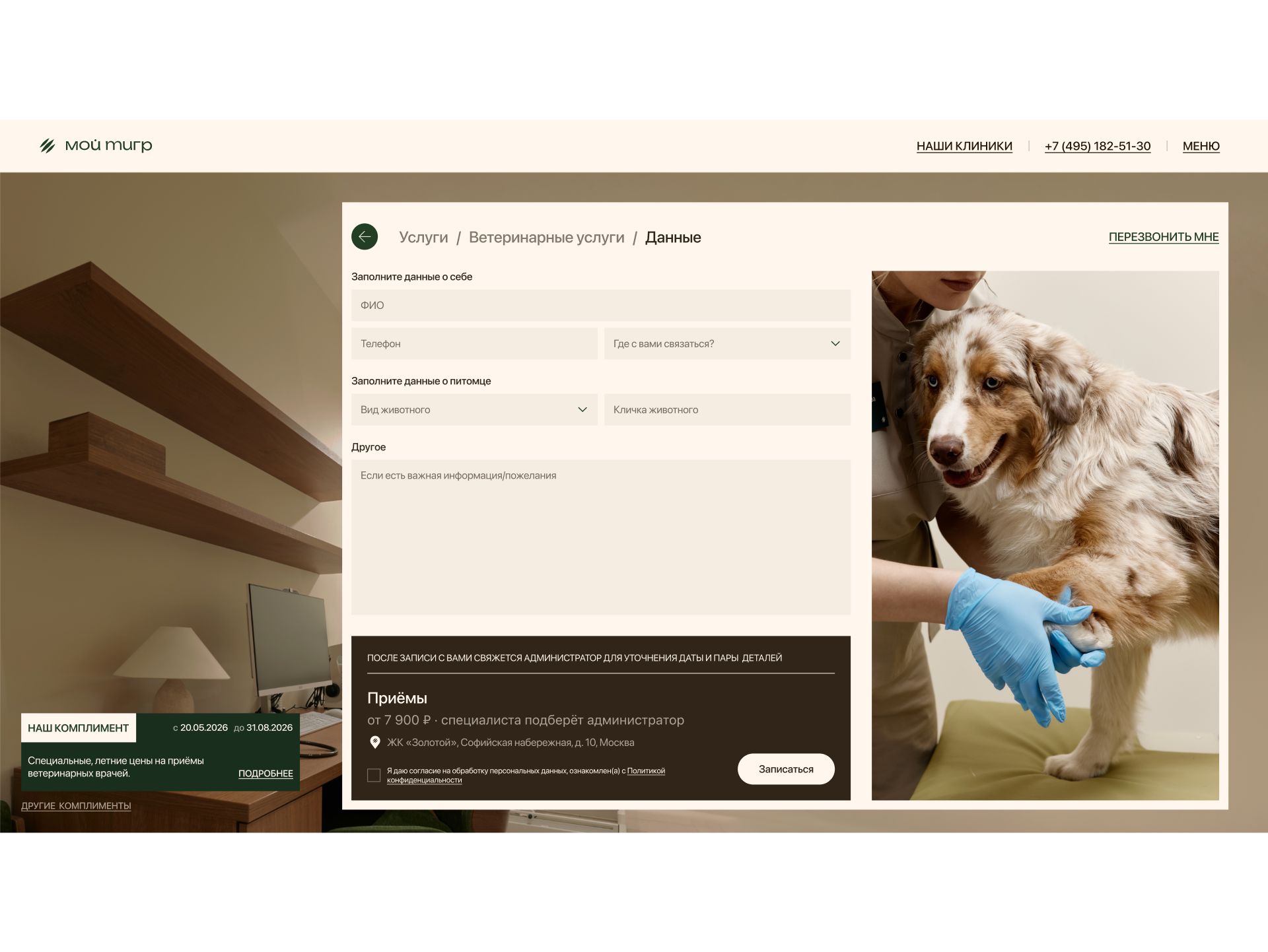
Booking on top of the page. The form opens right on the landing page over a photo of the exam room.
Why: no need to go anywhere — people do not get lost.
A short form. Name, phone, pet and a preferred way to be contacted, or a callback. Since an exact time cannot be chosen, the form honestly collects contact details and the administrator agrees the time.
Why: quick to fill in, and the reply comes where it is convenient.
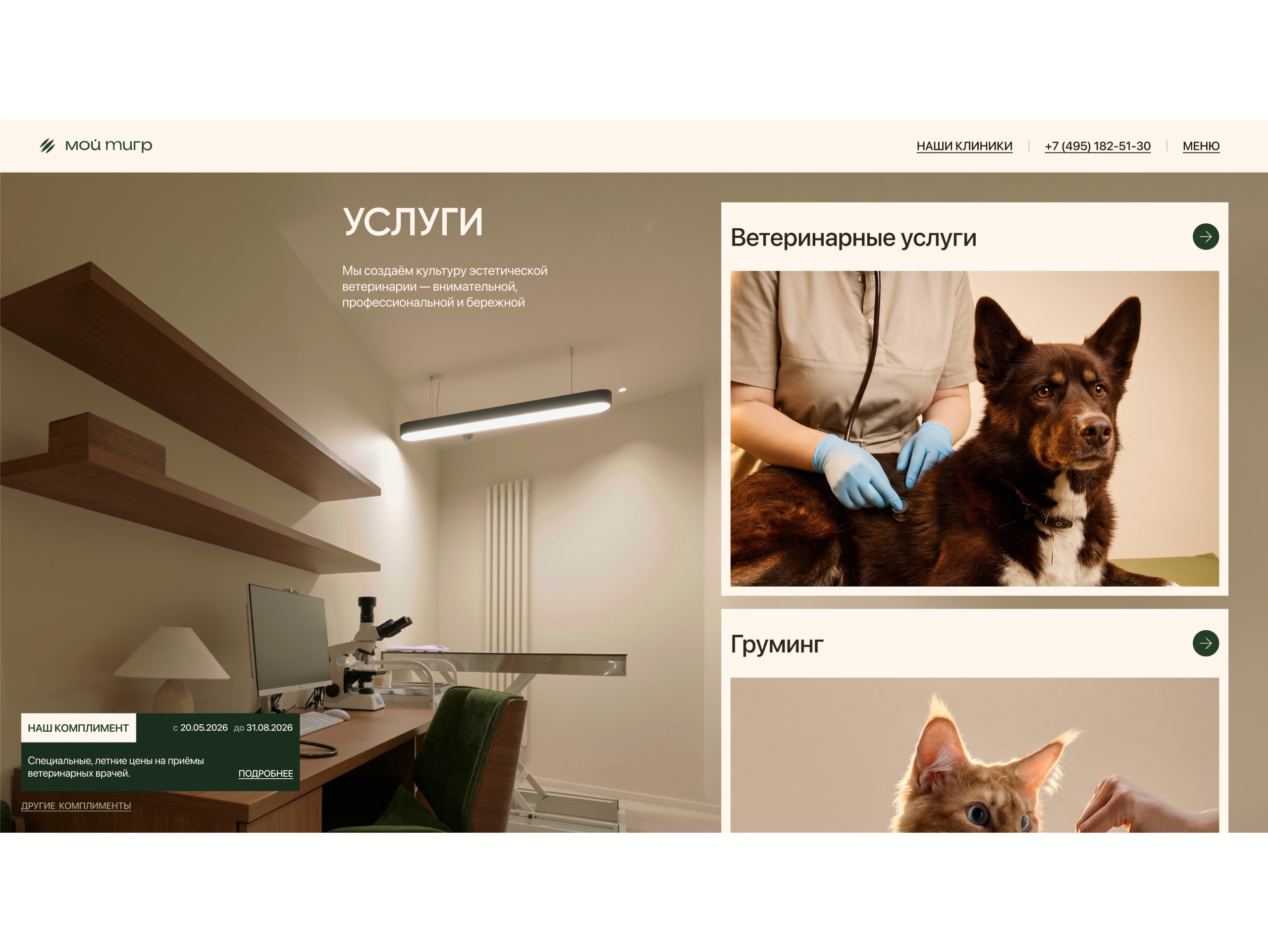
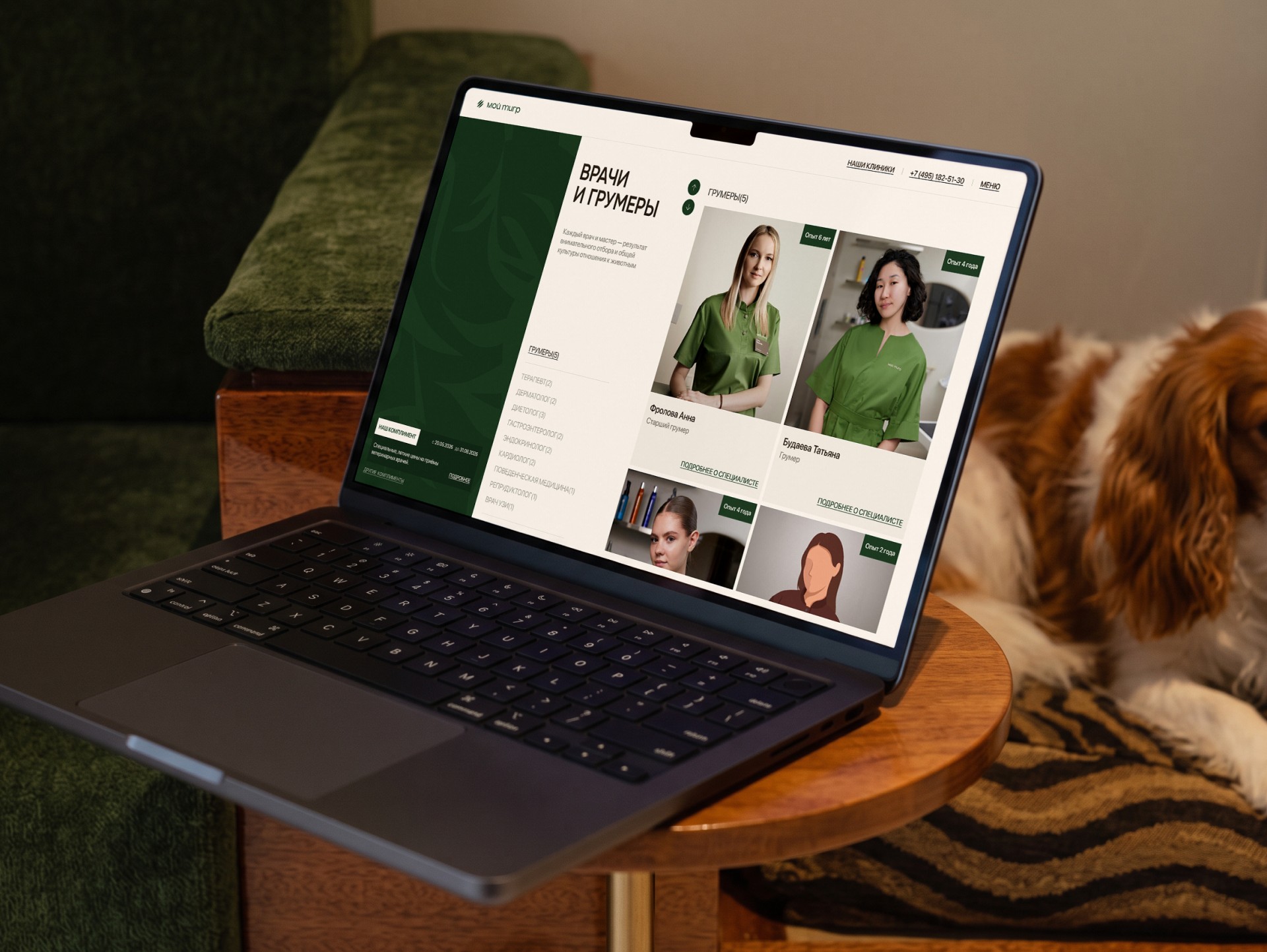
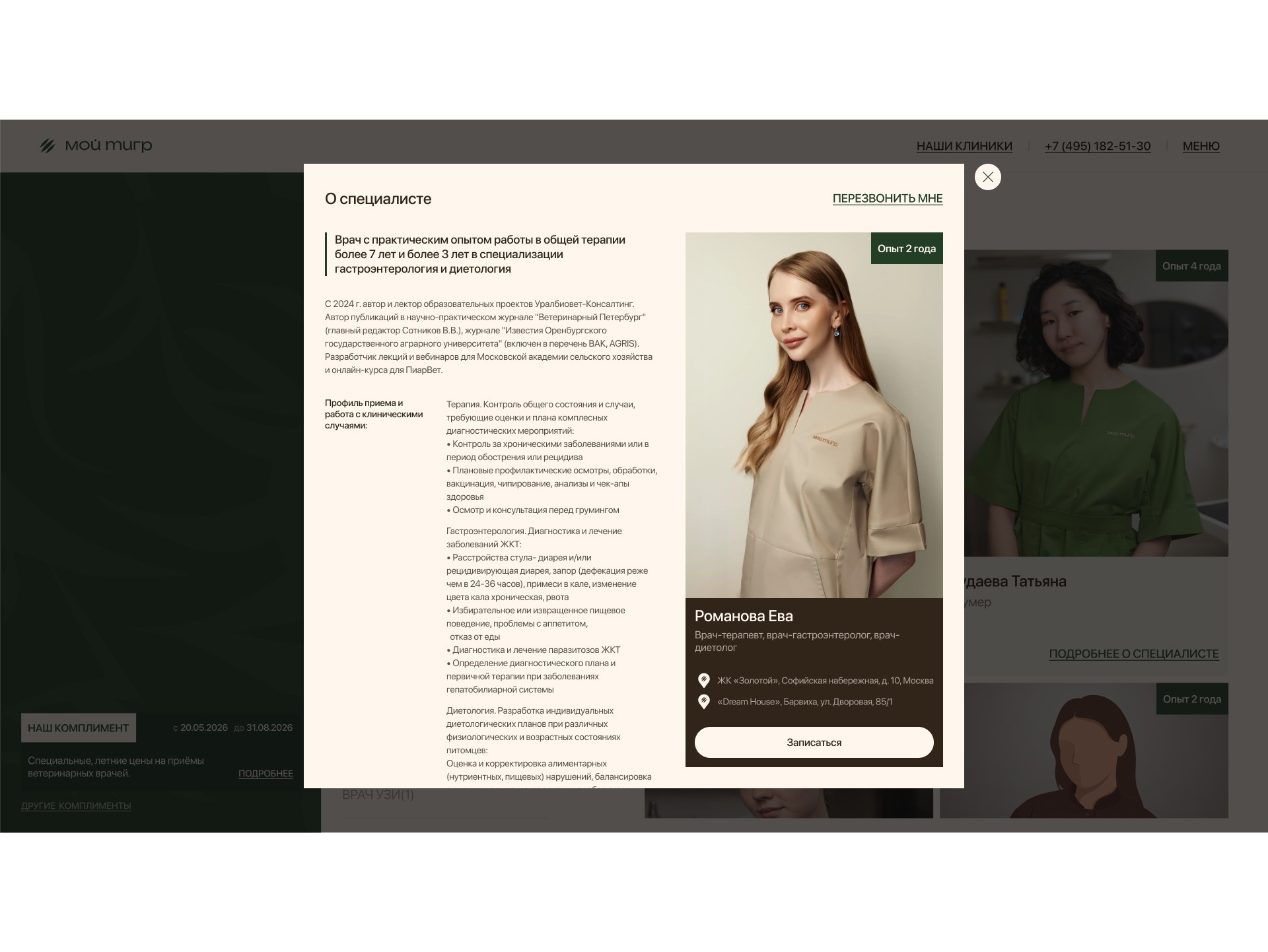
Grooming next to veterinary care. Vets and groomers are one team.
Why: trusting your pet is less scary, and a haircut becomes health care.
“Compliments” instead of discounts. A special price with a deadline and an explanation of why the pet needs it.
Why: a reason to book now, without the clinic looking cheap.
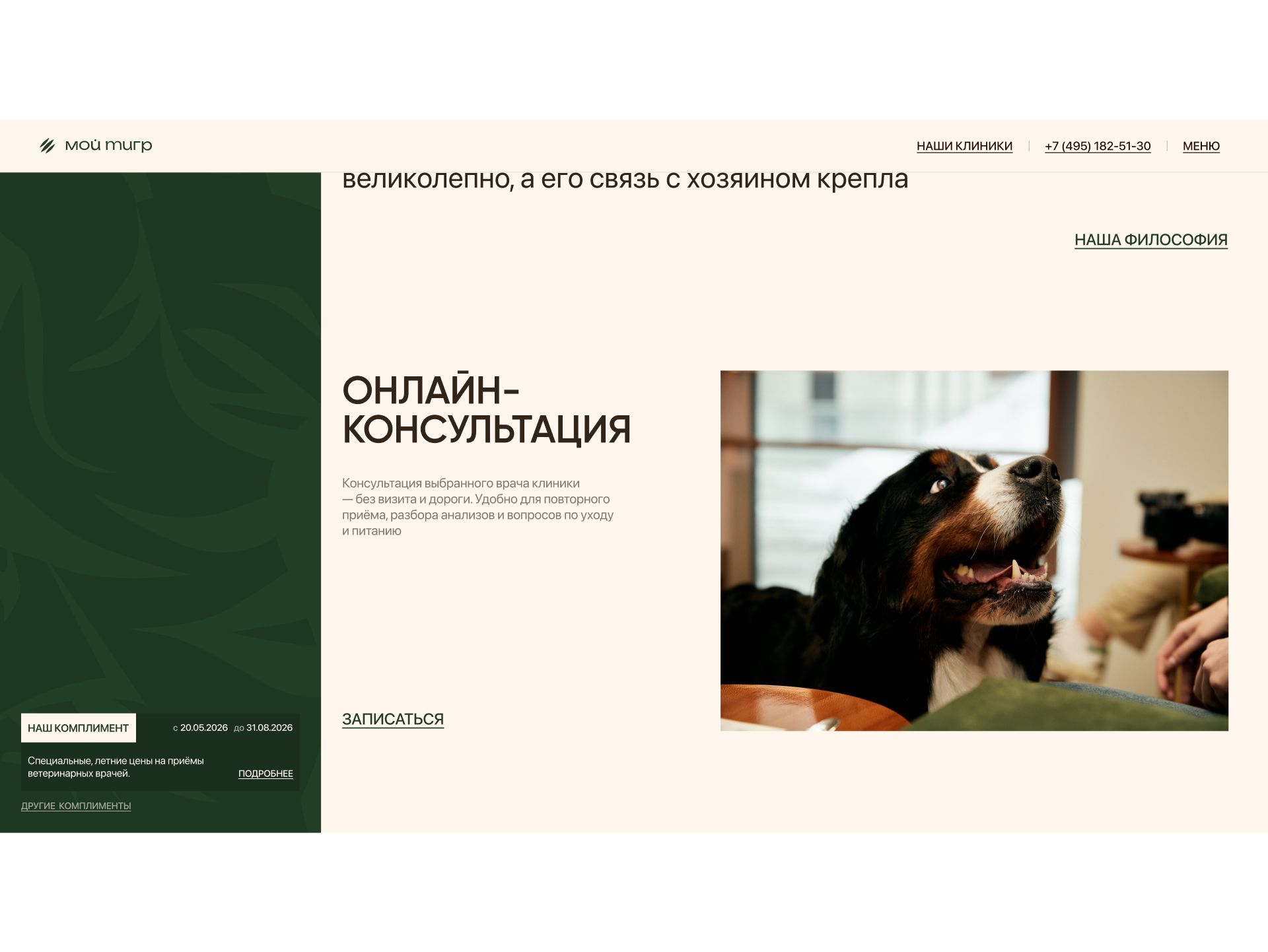
Online consultation. Its own short booking path.
Why: a first step for those not yet ready to come in.
Reviews and clinics on a map. Rating, addresses, opening hours and directions at the end of the page.
Why: answers to “can I trust them?” and “how far is it?”.
Defending the design and the developer handoff
I showed the client not pictures but a working page — and explained how each decision helps bookings. The main thing I defended was dropping discounts.
I gave the developers all screens, windows and booking steps, with post-review changes annotated right in the layout.
How I work. In two months I took the project from research to development on my own, and I show contentious decisions on a live prototype.
Results
The page is live and numbers are being collected: we compare how many bookings come from the landing page and from the main website. As soon as there are results, they will be here.
What became easier
Four paths to booking: services, vets, “Compliments”, consultation.
Short booking right on the page.
Contact where it suits you: phone, messenger or a callback.
How the page explains the clinic’s value
Trust first — people and the place, then the request to book.
A haircut as health care thanks to the groomer and vet working together.
Special offers without discounts — the clinic stays premium.
How AI helped
Claude — collecting and analyzing data. Reviews of clinics and groomers — owners’ main fears. Far more sources, so the findings are more accurate. 5 minutes instead of a whole day of manual search.
Claude — analyzing main-site requests: by service and source. 2 minutes instead of 2 hours in Excel.
Claude — a live coded prototype. A working page, almost like the finished product, ready for testing. 20 minutes instead of up to 6 hours in Figma.
Claude + Figma Agent — preparing the file for developers. Styles, layer names, versions for different screens, the design system, checks for missing screens and user-flow logic. 1 hour instead of 16 hours of work.
AI saves time; the decisions are mine.