
sCPlab
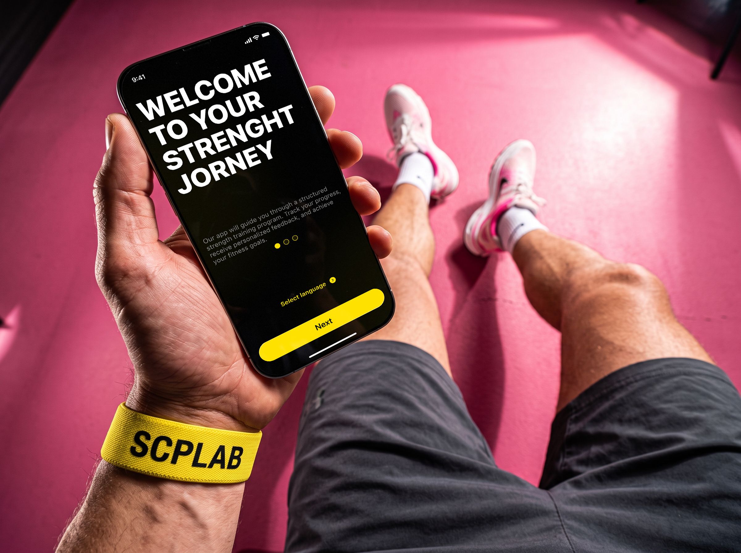
SCP LAB is a mobile coaching app for professional athletes. It builds a training program, shows video lessons from pros and tracks progress.
in this case
-
We stopped asking for money right away — so people pay full price.
First you try it and get your own program, then you pay. -
A button you can hit in the middle of a set.
Large buttons and full-screen video — everything one-handed. -
Why I dropped the easiest way to boost sales.
Three options and why a discount would not have worked here. -
A video nobody filmed.
How an AI-generated picture and a trip to the gym caught a mistake before the shoot.
 Ux/UI
Ux/UIProject at a glance
Role. The only designer on the team — the whole app design was on me.
Timeline. 8 months.
Starting point. A brand-new app — all I had was a map of the screens.
Outcome. 68 screens and a ready design system the developers build the app from.
The task
The client wanted more people to buy a full-price subscription after the free period, and starting a workout to be quick and easy. A separate request was a premium “glass” style.
The client’s technical condition: the subscription is sold only through the App Store. Its payment window is standard — you cannot change anything in it or explain things in your own words.
What I found out
How people pay. Apps usually ask for money right away or after a boring questionnaire — people leave without understanding what they pay for. So the value has to show before payment.
Where it is used. In the gym: sweaty hands, heavy breathing, glare. So the buttons are large and there is little text.
What brings people back. Pros know the basics — they want video lessons from top coaches. So video is the heart of the product.
Three options and how I chose
I compared the options with three questions: will people pay full price, is it convenient in the gym, and is it expensive to build.
A — a first-month discount. Quick, but it teaches people to wait for discounts, and the client needs full-price payments.
B — a shorter questionnaire, payment in the same place. Simpler, but people still pay without trying the product.
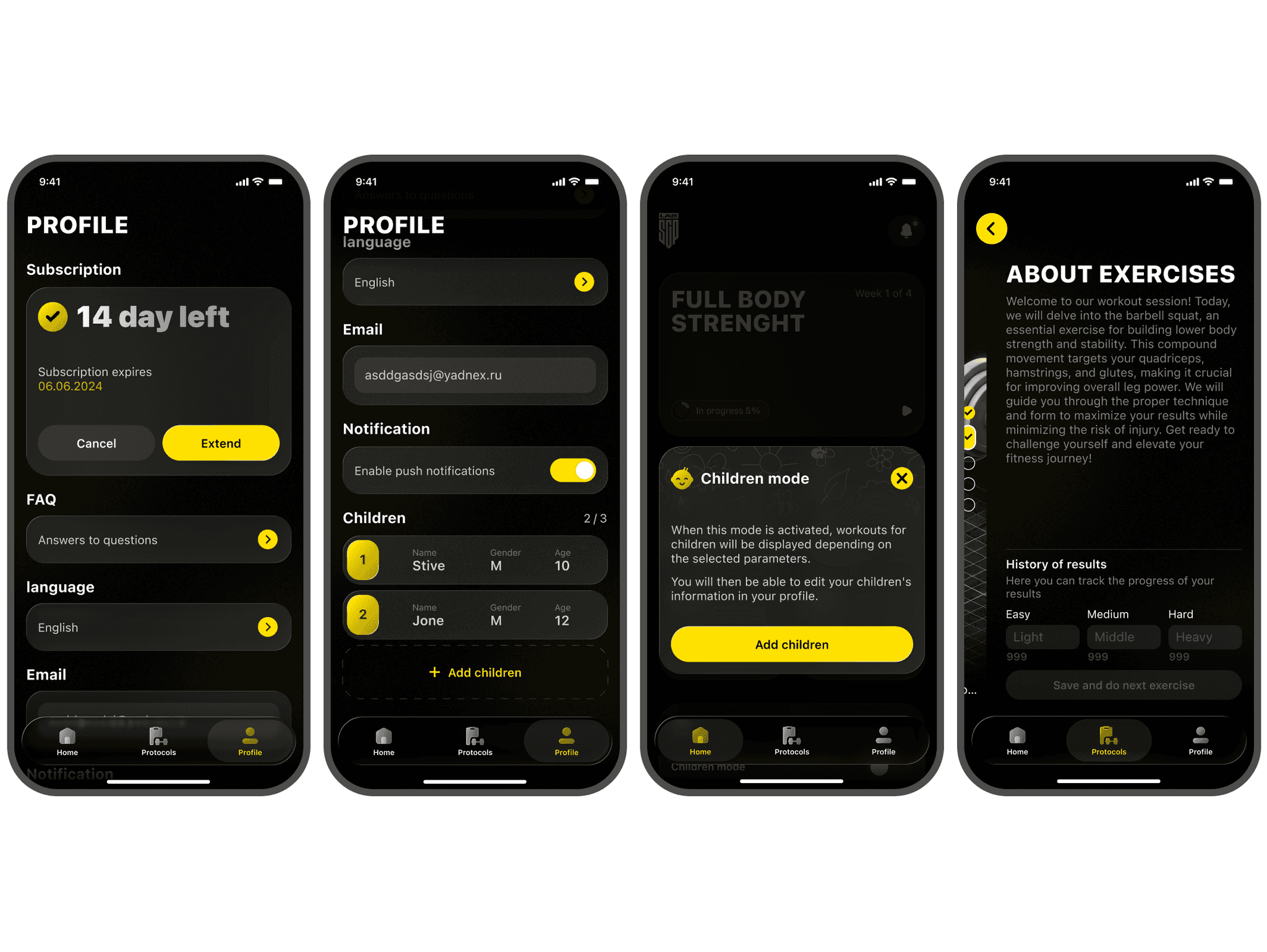
C — try first, pay later. A free assessment with video lessons, and the subscription once your own program is ready.
I chose C: people pay more willingly for what they have tried and put effort into. The downside is that money comes a bit later. I showed this to the client honestly and suggested how to test the decision after launch.
Where I was wrong and what I changed
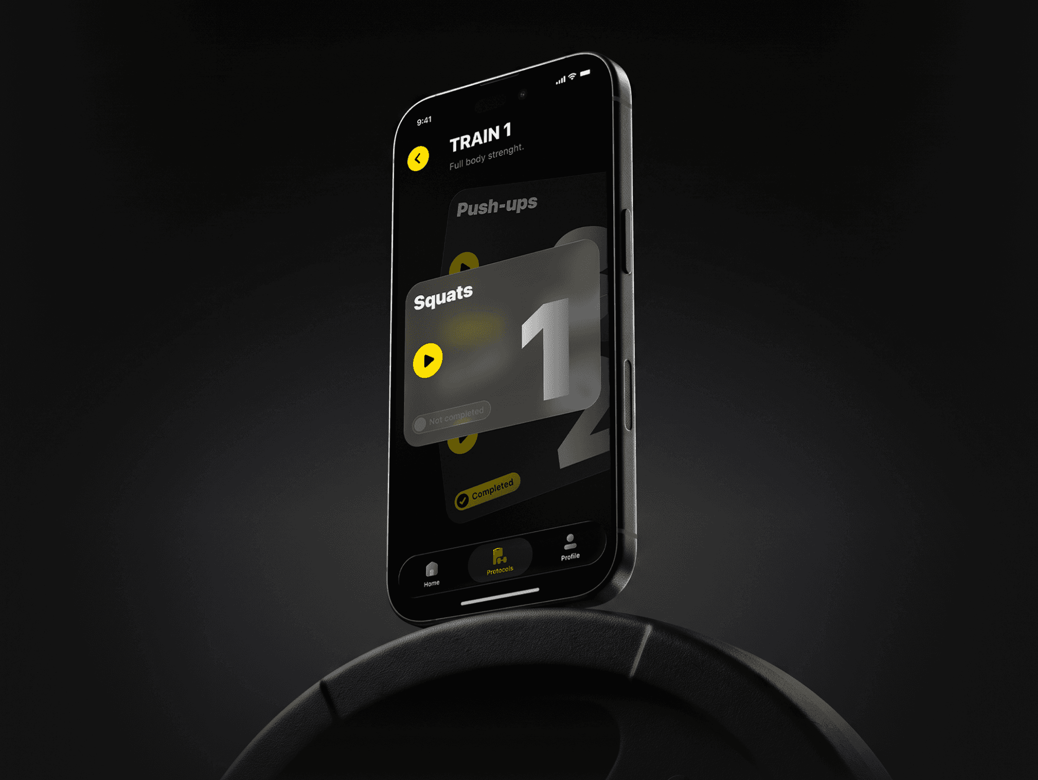
A “play” icon. At first the steps on the main screen looked like ordinary cards, and people lingered on each one, unsure where to tap. I added a “play” icon: it became clear the card starts a video. People lingered less.
A workout that never happened. The videos were not filmed yet, but I needed to check right away whether the screen reads over video in a gym. I generated a workout frame with poor lighting using AI, put the interface on top and took my phone to an ordinary gym — I looked myself and asked visitors to read the screen.
A problem turned up: the video progress icon on the right was too pale and got lost against the background. I made it more contrasting — now it is visible in any light. We caught the mistake before the shoot and development, so the fix cost the client nothing.
What I did and why
Payment at the end. First a free assessment with video lessons, then the message “your program is ready”, and only then the subscription.
How this solves the App Store condition: the standard payment window explains nothing, so before it we show our own screen: “your program is ready”, what it includes and what it costs. People reach Apple’s window already knowing what they pay for.
Why: people pay for something of their own, not for a promise.
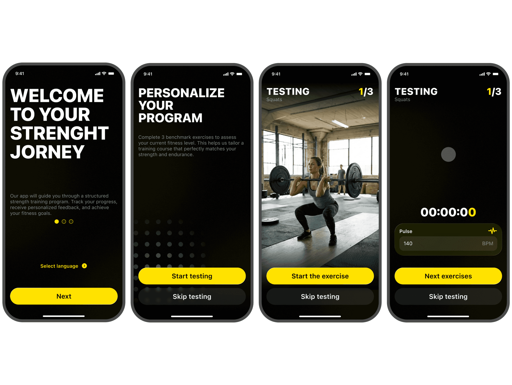
Video is the main thing on the workout screen. A large player, a timer and a couple of buttons.
Why: the value is always in sight, and the workout starts faster.
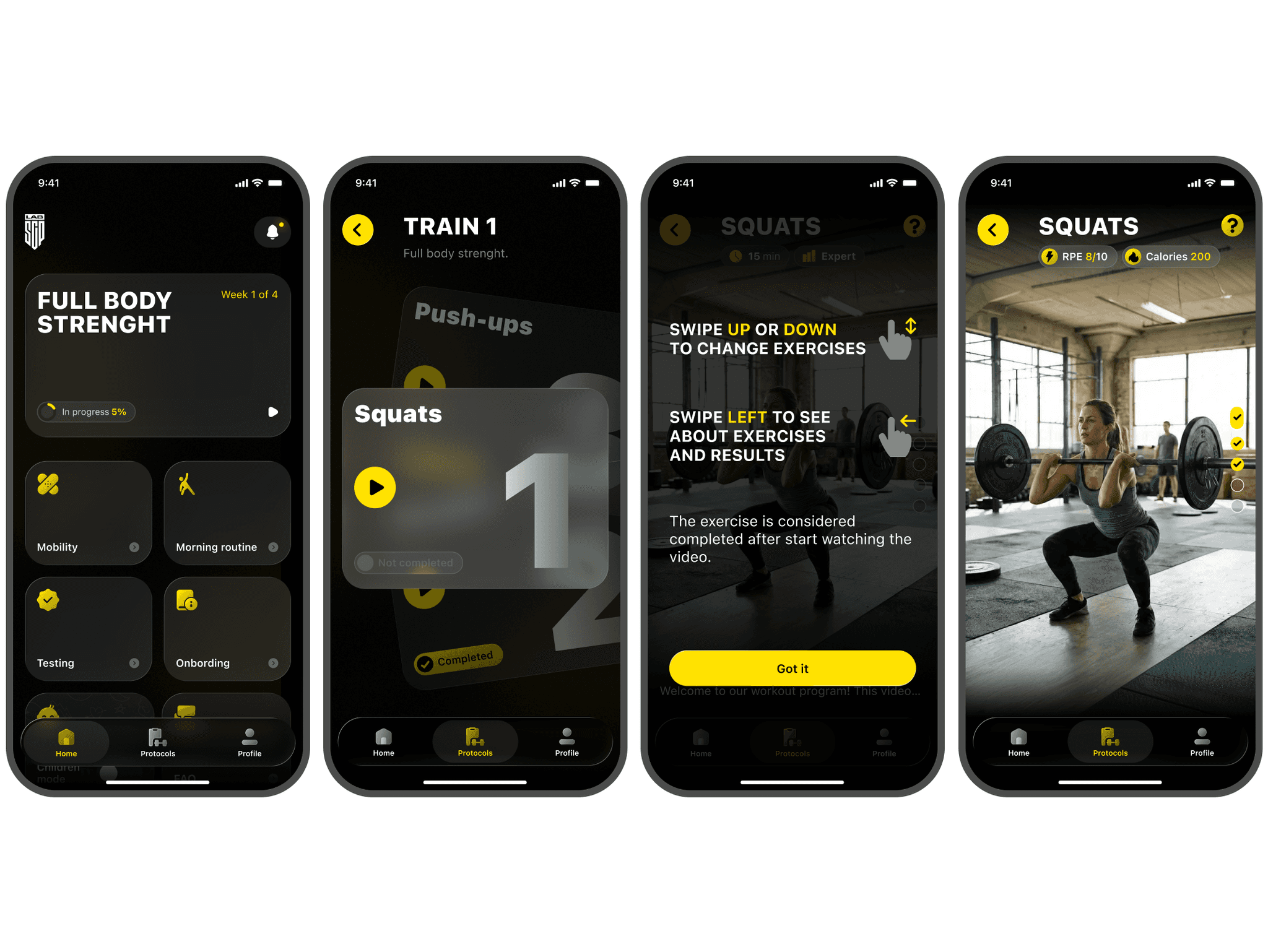
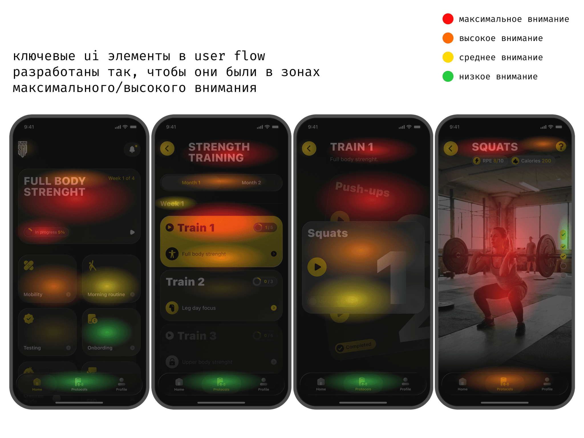
Large high-contrast buttons. Designed for sweaty hands and heavy breathing after a set.
Why: they are easy to hit mid-workout — the app is convenient right in the gym.
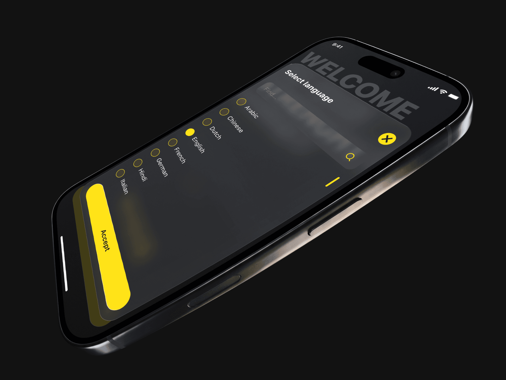
Style. Black background, neon-yellow accent, “glass” only in cards and windows.
Why: it looks expensive — paying full price feels right — and it still reads in any light.
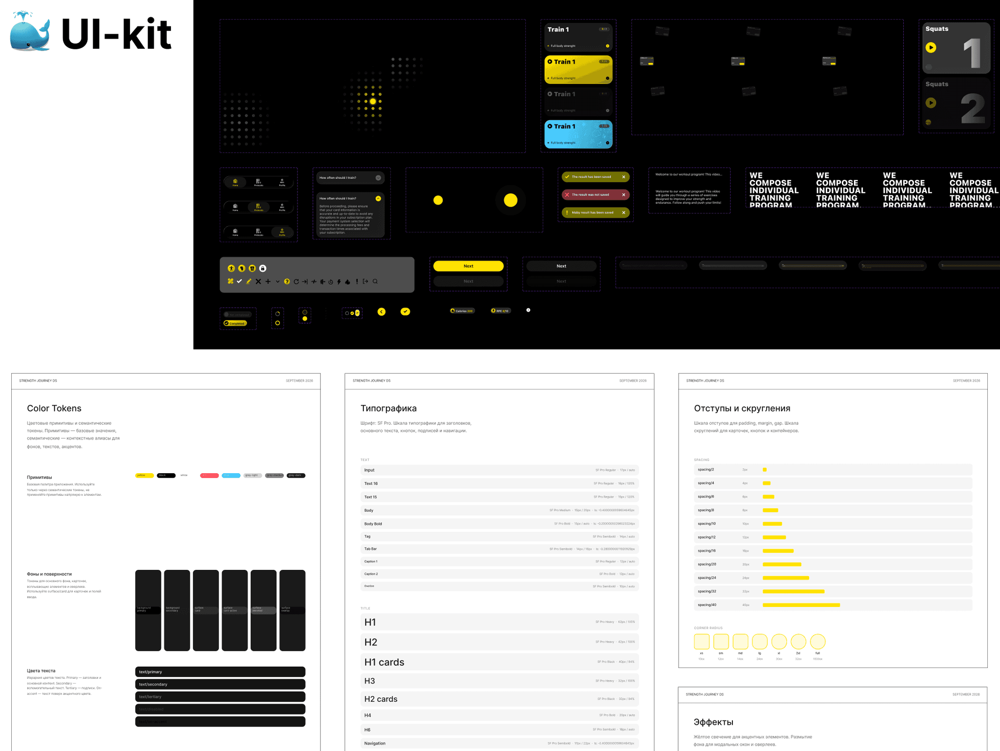
Defending the design and the developer handoff
I showed the client the whole chain — from what I found out to every decision. The main thing to defend was the late payment: money comes a bit later, but people pay full price. “Glass” was approved only where it does not get in the way of video.
I handed the developers a tidy file — all screens, button states and annotated animations. Development goes faster and without extra questions, which makes it cheaper for the client.
How I work. For eight months I was the only designer, so I explained every decision through the business goal and spoke openly about the risks.
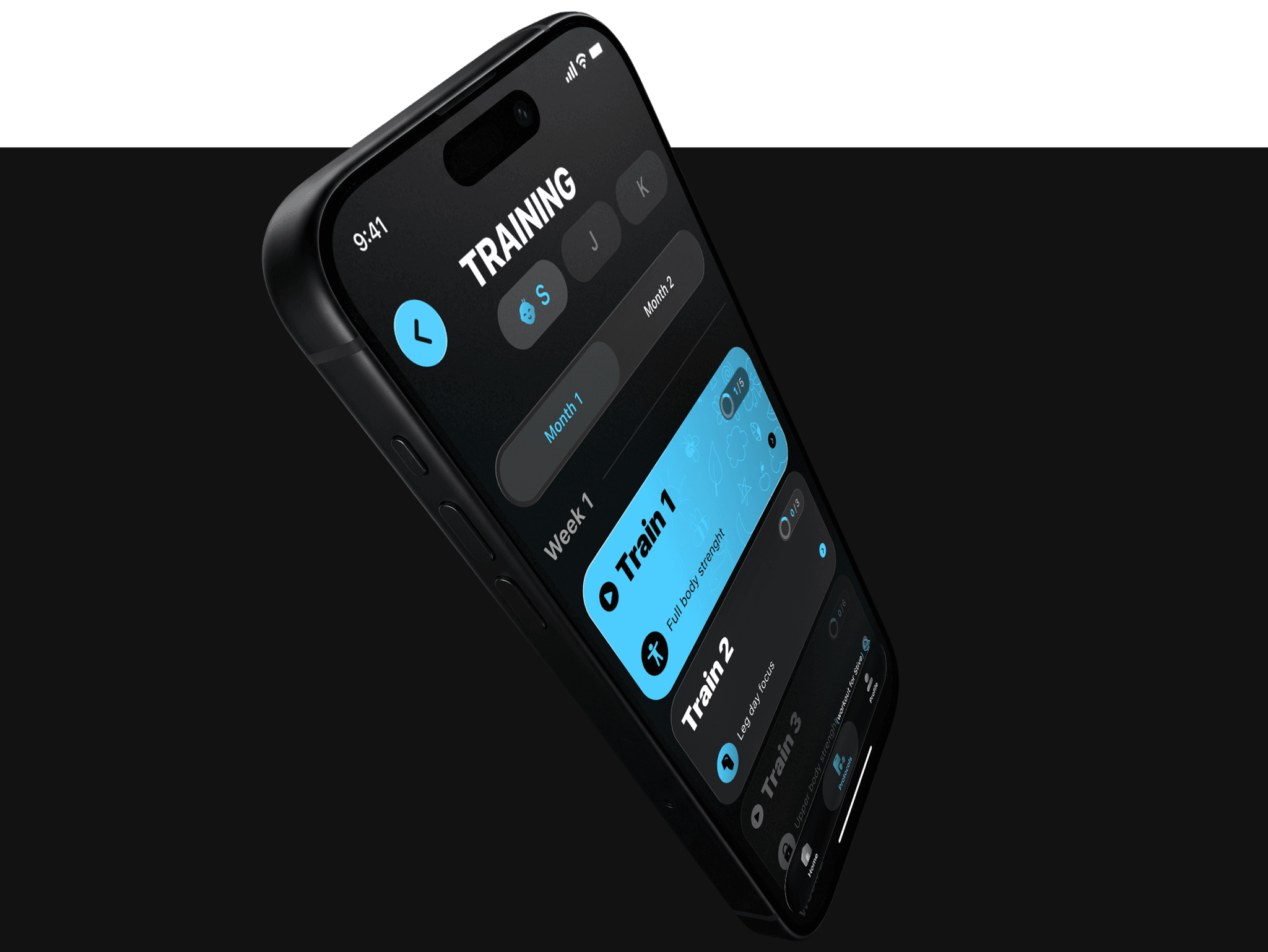
Results
The app is only launching, so I describe what I changed and what it should affect.
What became easier in the app itself
A new way into the app: first the assessment and your own program, then payment. Should bring more full-price subscriptions.
A simple workout screen: video, a timer and a couple of one-handed buttons. Workouts start faster.
Clear where to tap: a “play” icon on the steps — fewer pauses on the way to the first workout.
A visible video indicator: you see how much is left at a glance.
A reason to come back: smart reminders and a weekly progress report.
How the app explains its value
Value first, price second: coaches’ videos and your own program are visible before payment.
Clear what you pay for: the message “your program is ready” makes payment a logical step, not a barrier.
Looks like a tool for pros: the premium style justifies the full price.
Everything reads in a second: large text and contrast — even in the gym between sets.
How AI helped
Claude — collecting and analyzing data. Competitor reviews and the user’s path to payment. Far more sources, so the findings are more accurate. 5 minutes instead of a whole day of manual search.
Gemini — workout frames. Checked the screen over video in a gym before the shoot.
Claude + Figma Agent — preparing the file for developers. Styles, layer names, versions for different screens, the design system, checks for missing screens and user-flow logic. 1 hour instead of 16 hours of work.
AI saves time; the decisions are mine.