
sCPlab
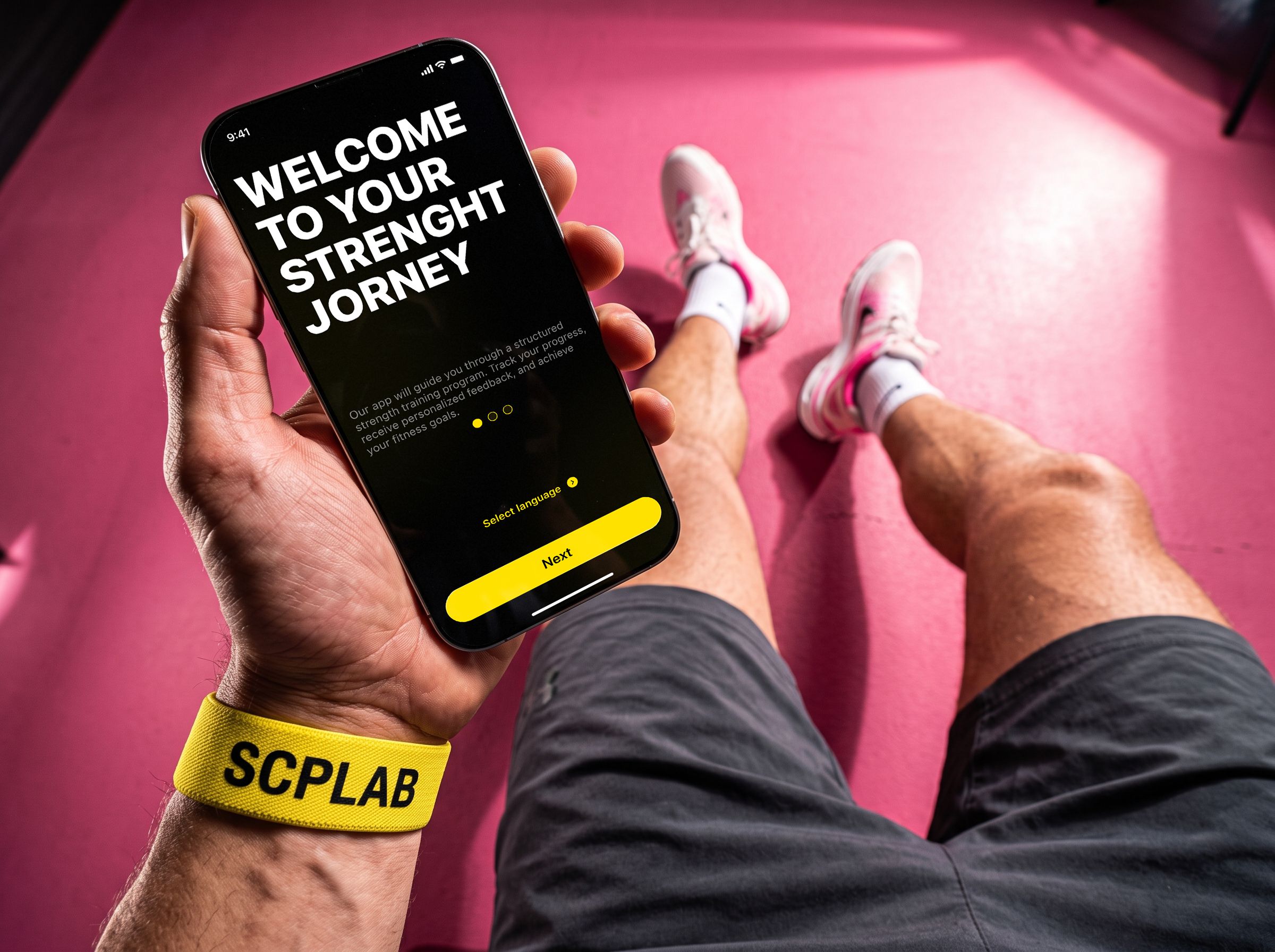
SCP LAB is a mobile app that acts as a personal trainer for professional athletes. It analyzes the user’s physical data and generates an adaptive training plan to build strength. The core features are video instructions from professionals with individually tuned load, a progress tracker, smart reminders and weekly performance analytics.
in this case
-
We started asking for money later — so people pay full price.
The paywall moved to the end of the free assessment: people pay for a program that is already built. -
An interface for hands that shake after a set.
Large high-contrast controls and full-screen video — everything works one-handed. -
Why I dropped the most obvious idea — a discount.
Three options, the selection criteria and the risk I had to defend. -
A neural network filmed a workout that never happened.
How a generated frame and a trip to the gym caught a mistake before the shoot.
 Ux/UI
Ux/UIProject at a glance
Role. The only designer on the team, responsible for the entire product design.
Timeline. 8 months.
Starting point. A brand-new product — all I had was an app map.
What I did. Research, user flows, UI, the design system and the developer handoff.
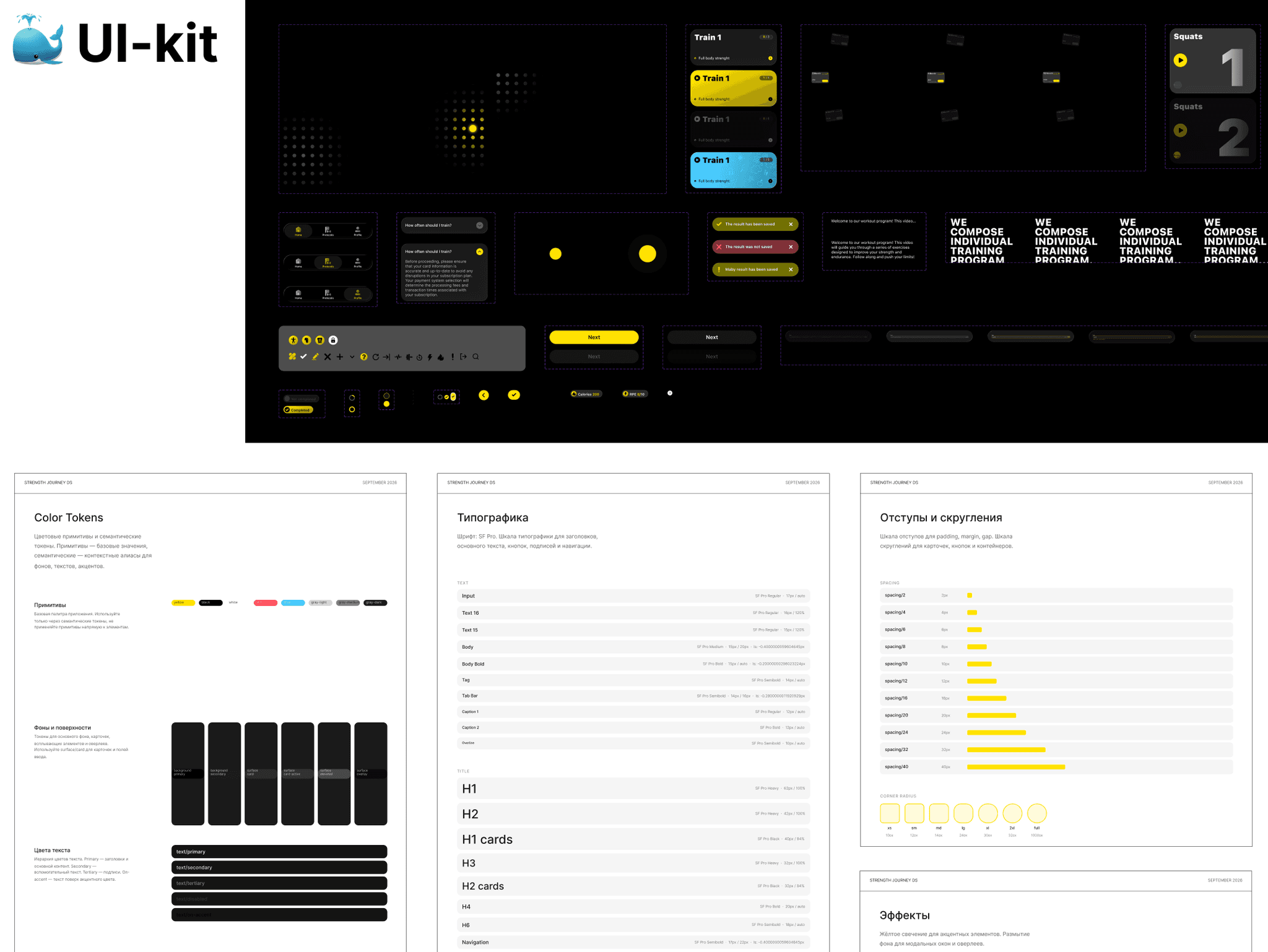
Outcome. 68 screens, a UI kit of 88 components and dev-ready layouts with every state.
Task and constraints
Design a mobile coaching app for professional athletes from scratch.
Business goals: cut the time to start a workout and convert more users from the free trial to a full-price subscription.
Client request: a premium glass effect in the interface.
Technical constraint from the client: the subscription is sold only through App Store in-app purchases. The payment sheet is a system one — it cannot be changed or supplemented with our own arguments — and the price and trial are set in App Store Connect, not in the app.
What I found out
Competitors. Video and programs work; users complain about paywalls that appear before they understand what they are paying for. Takeaway: stand out with features and design, not price.
Funnel. Fitness apps ask people to pay before they feel any value. Takeaway: athletes should invest effort in the product before paying.
The gym. Sweaty hands, tremor after a set, glare from the lights. Takeaway: large, high-contrast, a couple of taps.
Content. Pros know the technique; what brings them back is video from top coaches. Takeaway: video is the core of the product.
Three options and how I chose
I compared the options on three criteria: does it grow full-price payments, does it work in gym conditions, and how much does it cost to build.
A — a first-month discount. A quick win, but it teaches people to wait for discounts and does not grow full-price payments — the main goal.
B — a shorter questionnaire, paywall in the same place. Less friction, but people still pay without understanding what for.
C — value first, payment second. The athlete takes a free assessment with video lessons and sees the subscription once a personal program is ready: people pay for what they have invested in (the IKEA effect).
I chose C — it is the only option that covers all four research findings. The risk: the first payment comes later. I did not hide it — I brought it to the review together with a post-launch test plan: compare the paywall at the start and at the end of the assessment by full-price conversion.
Where I was wrong and what I changed
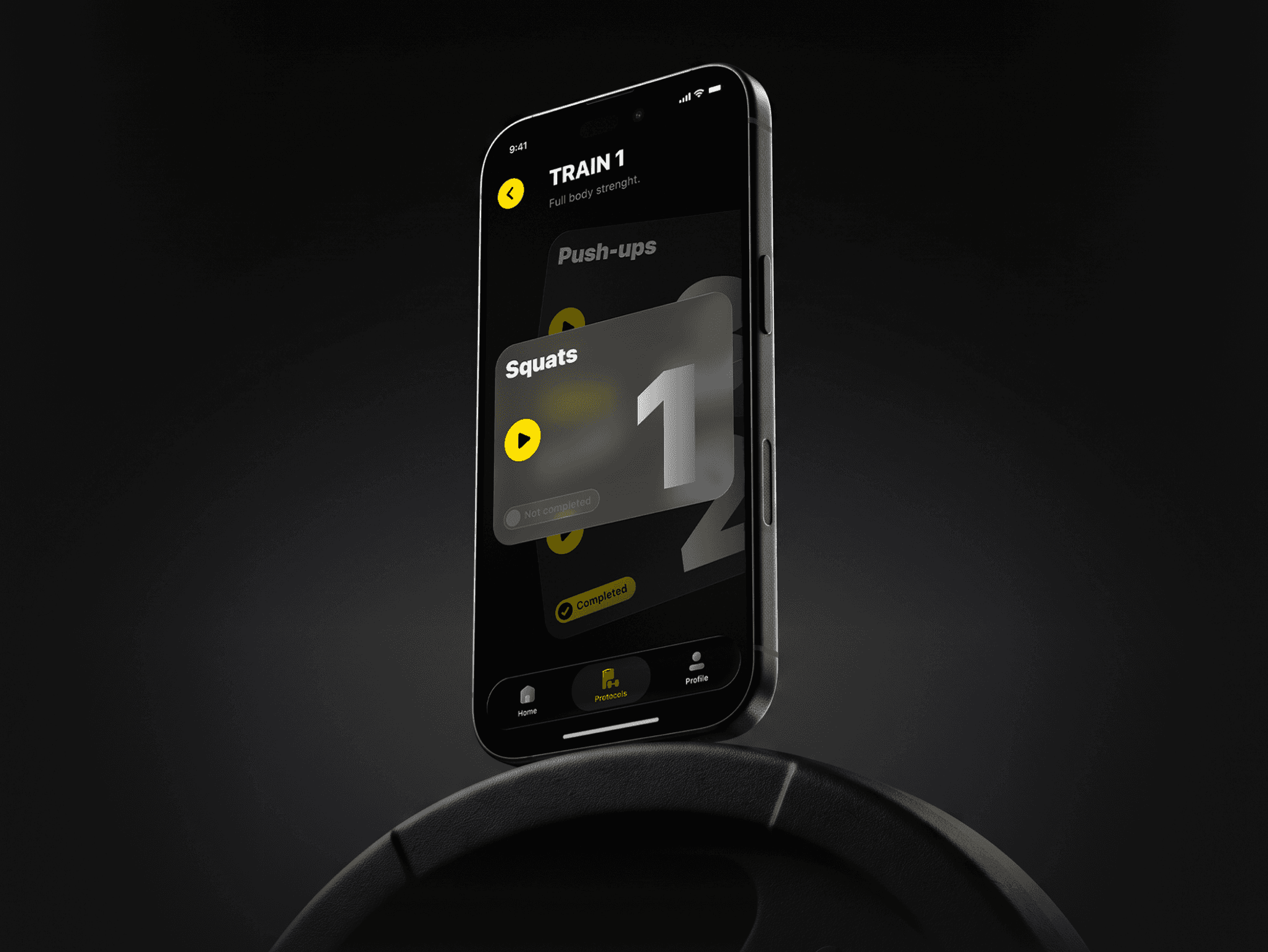
A “play” icon on the steps. In the first version the cards on the main flow looked like ordinary cards, and people lingered on every step, working out what to do next. I added a “play” icon: it is immediately clear that the card starts a video and the next step. People linger less on each step.
A workout that never happened. There was no video shoot yet, but I needed to check right away whether the interface stays readable over video in a gym. I generated a workout frame with poor lighting, put the interface on top and took my phone to an ordinary gym: I checked it myself under bright light and asked random visitors to read the screen and tap the right button.
The check revealed a problem: the video progress indicator on the right was not contrasting enough and got lost against the frame. I redesigned it — now it reads in any light. I caught the mistake before the video production and development, where fixing it would have cost more.
Decisions and what they target
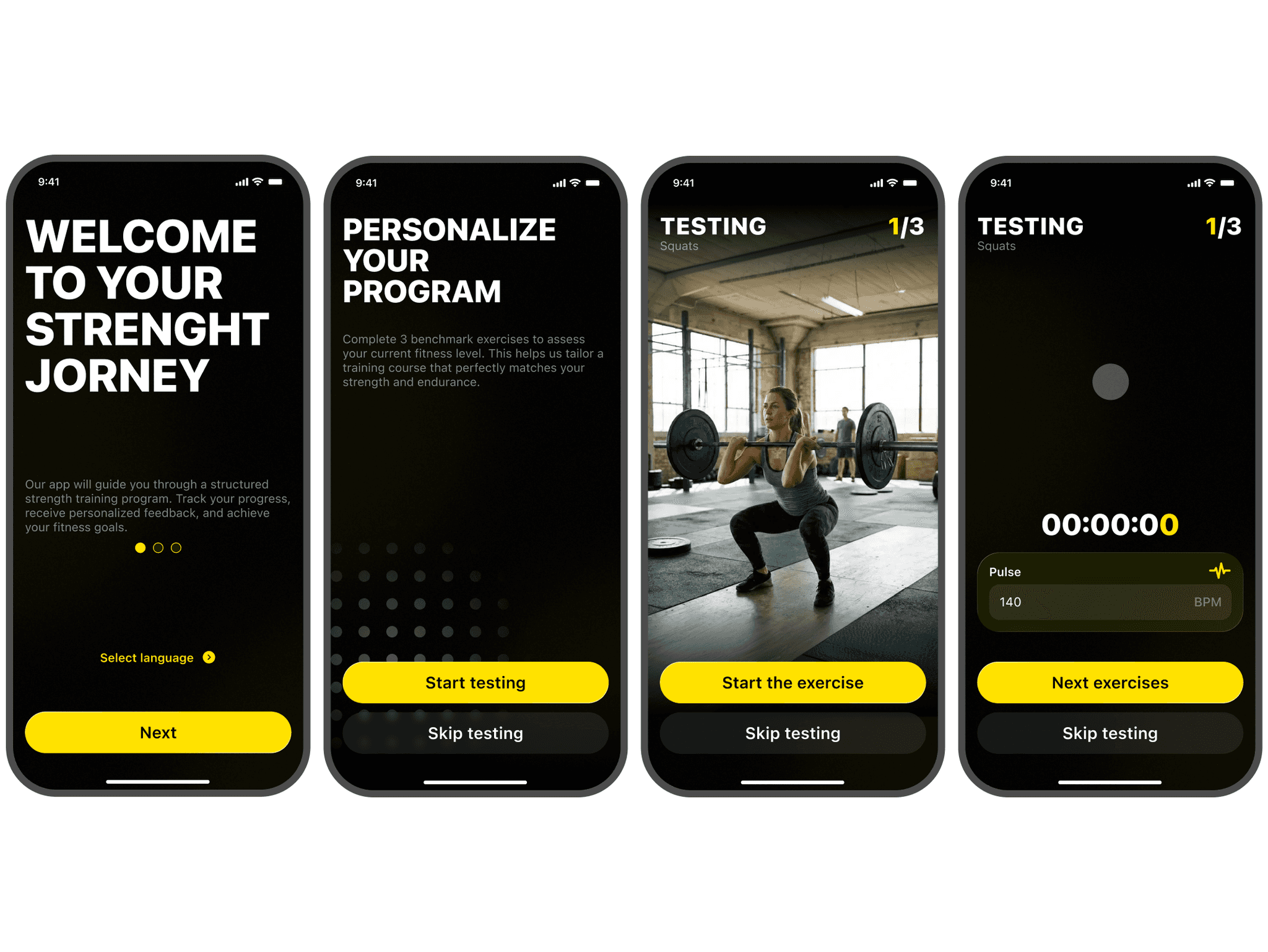
Paywall at the end of the assessment (UX funnel). First a physical assessment with a metronome and video lessons, then the message “your personal program is ready” — and only then the subscription.
How this answers the App Store constraint: the system payment sheet explains nothing, so all the work of conveying value is done by our screen before it — “your program is ready”, what it includes and what it costs. People reach the system sheet already knowing what they are paying for.
Targets: full-price payments — people pay for a program already built for them.
Video at the center of the workout screen (UI). A large player, a timer and basic controls — nothing else.
Targets: a fast workout start and return visits — the core value is in sight at every workout.
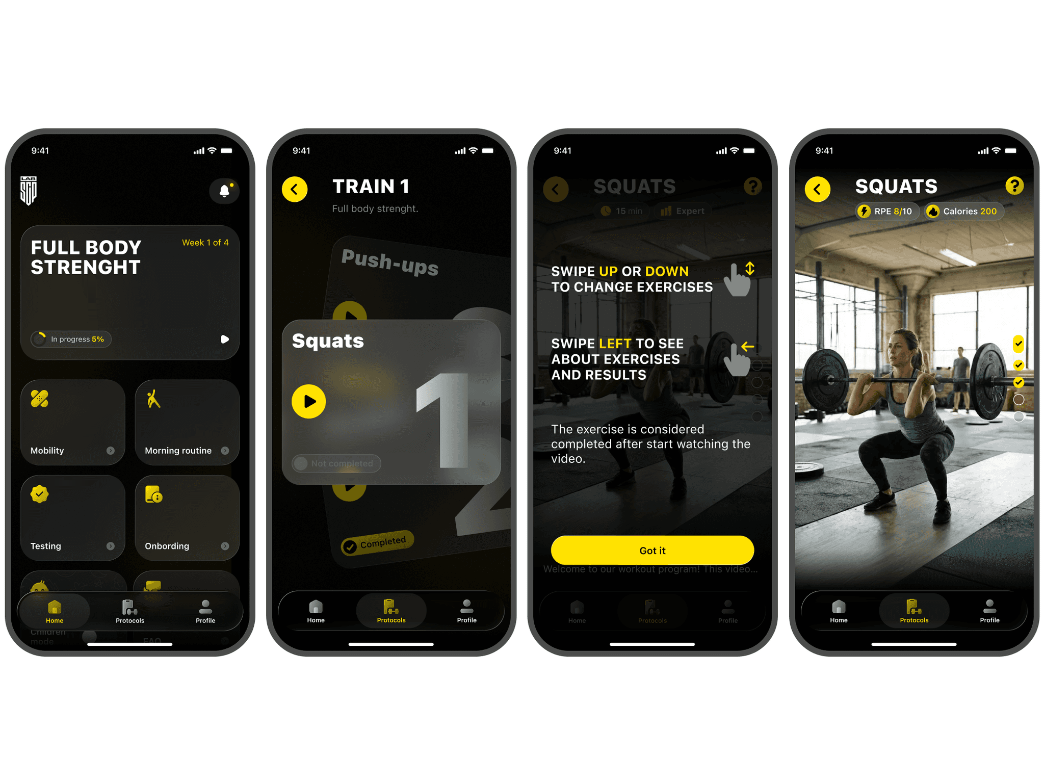
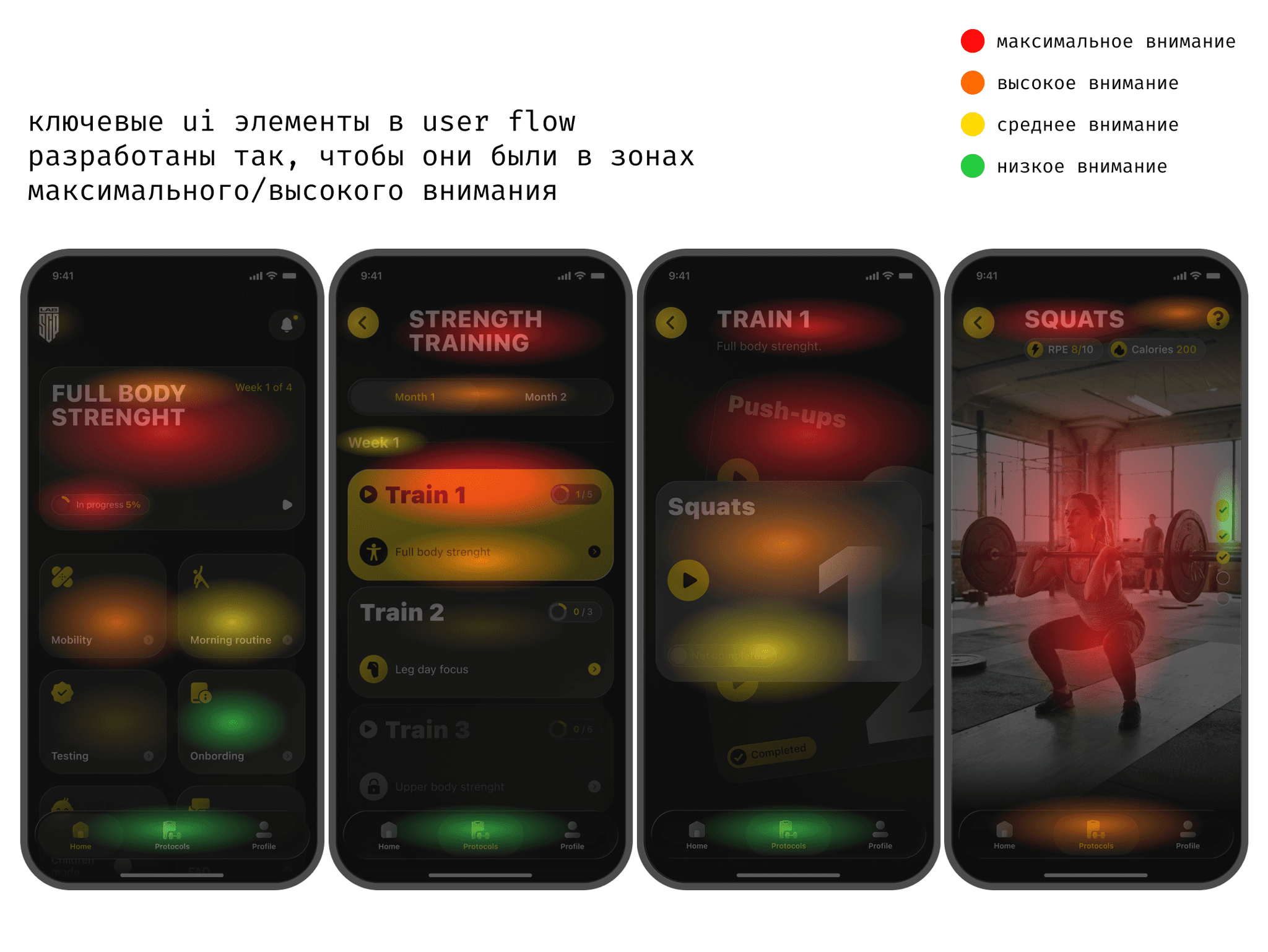
Large high-contrast elements (UX). Tap targets and indicators are designed for sweaty hands and tremor after a set.
Targets: hitting the right button the first time and using the app right between sets.
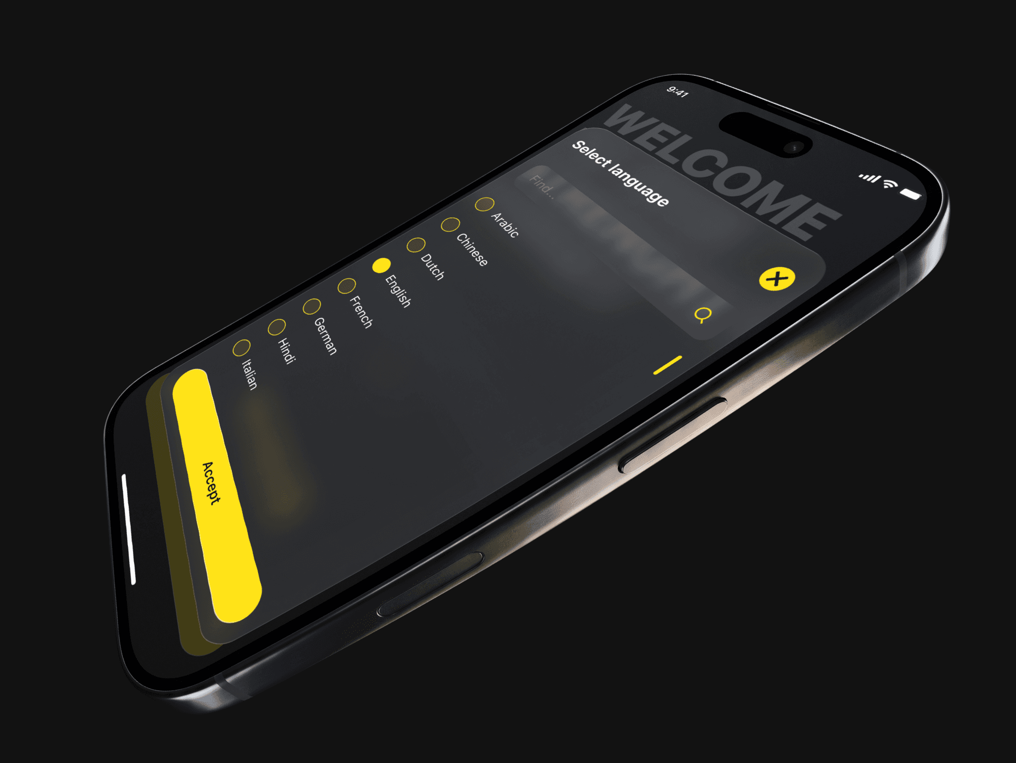
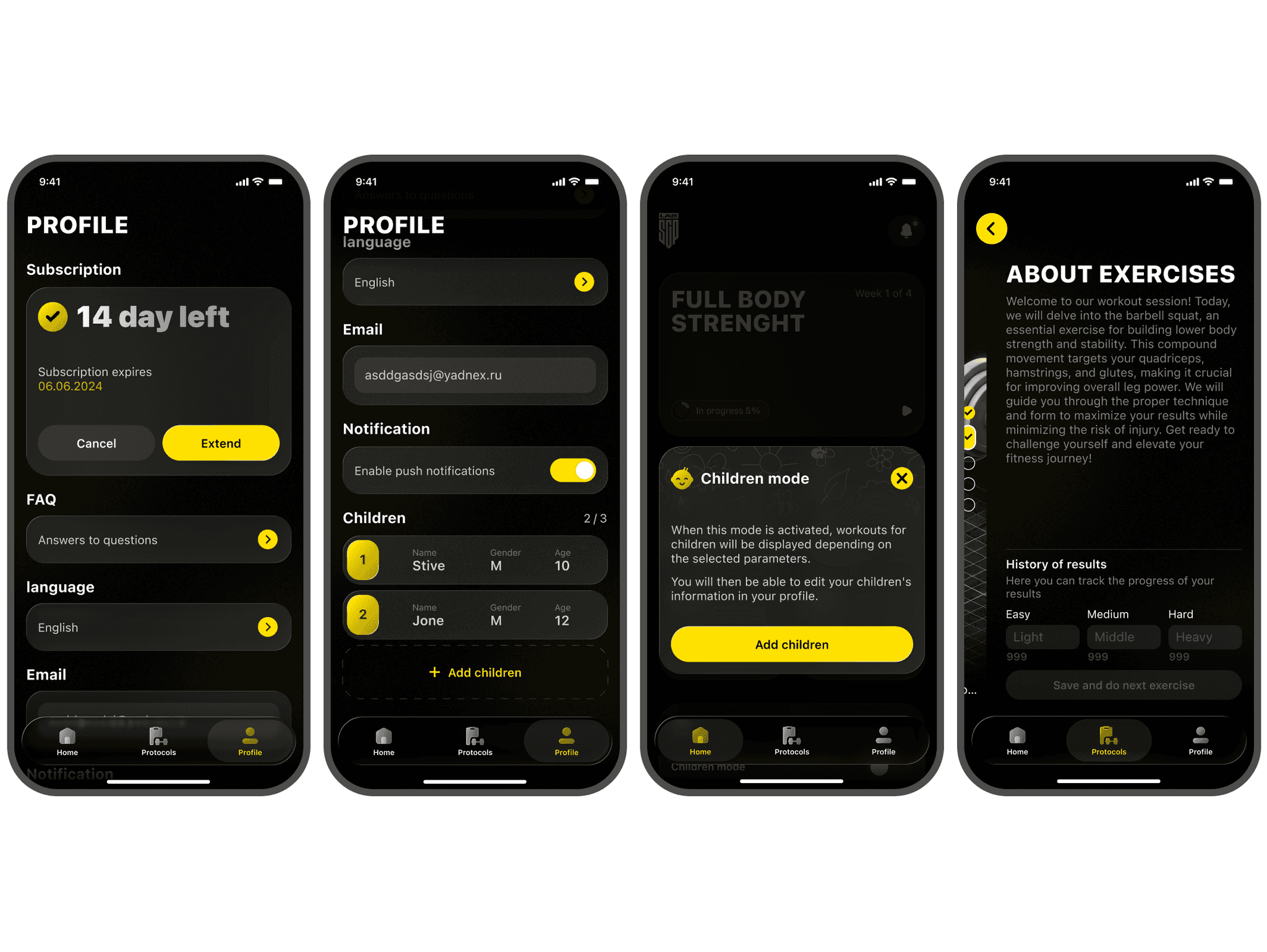
Glass only where it does not get in the way (UI). Deep black background, neon-yellow accent, glassmorphism and liquid glass only in cards, modals and alerts.
Targets: the client’s request is met, the premium look justifies the full price, and video and gym readability do not suffer.
Defending the design and handoff
I walked the client through the whole chain: research findings, three options, the selection criteria and the reasoning behind every decision.
The main thing to defend was the late paywall: the first payment comes later, and that looks like a risk. My argument: the goal is a full-price subscription, and people pay more willingly for what they have already invested in. I attached a post-launch test plan to it. Glass was approved in limited use — only where it does not interfere with video.
I handed over the layouts systematically: all screens, states and modals are built with Auto Layout and linked to a UI kit with a design system; animations are annotated.
How I work. For eight months I was the only designer, so I tied every decision to a business goal and argued for it myself. I raise contentious decisions openly — together with the risk and a way to test it.
Results
The product has no statistics yet, so I describe what I changed and which metric each change targets.
Product — how the product works and how people use it
Rebuilt the entry into the product: assessment with video lessons → “your program is ready” → subscription, instead of a paywall at launch or after a questionnaire. Targets higher full-price conversion.
Simplified the workout screen: video, a timer and basic controls, all one-handed. Targets less time to start a workout and between sets.
Made main-flow navigation obvious: a “play” icon on the cards shows what to tap next. Targets onboarding completion.
Made the video progress indicator readable after the gym check: athletes see how much is left at a glance. Targets workout comfort and return visits.
Designed retention features: smart reminders and weekly progress analytics. Targets retention — a reason to come back and visible progress.
Communication — how the product conveys its value
Value before price: top coaches’ videos and your own program are visible before you are asked to pay — the product explains what the subscription is for.
The payment moment is explained: the message “your personal program is ready” turns the paywall from a barrier into the logical next step.
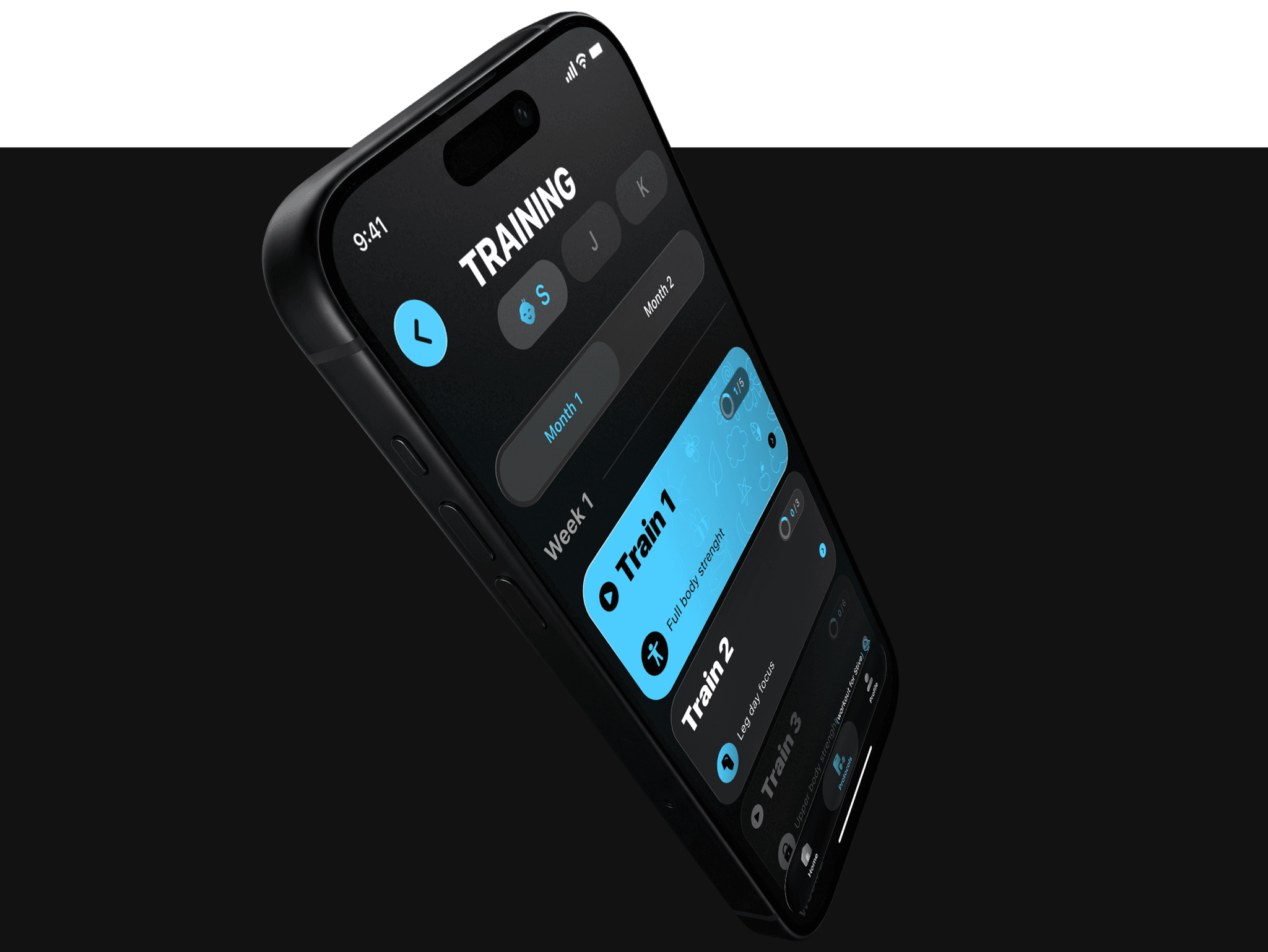
A visual language for pros: deep black, a neon-yellow accent and glass say “premium tool”, not “yet another tracker” — which justifies the full price.
Information reads in a second: large type and high contrast get the point across in the gym between sets, without reading closely.
68 screens · 10 UX tests · 15 sections · 88 components in 22 sets · 47 styles · 59 variables · 5,983 instances · 117,020 nodes · 27 images · 4 font families
How I used AI
Claude — collecting and analyzing data for the task. Competitor reviews from the App Store and Google Play, fitness-segment patterns, the user journey and funnel logic — UX pain clusters and arguments for the late paywall. The main gain is quality: data used to come from a limited set of external sources, while Claude covers an incomparably wider range, so the findings rest on a fuller picture. ≈ 5 minutes instead of up to 24 hours of manual search — dozens of times faster.
Gemini — frames for checking the interface. I generated workout frames with difficult light to check the interface over video in a real gym before the shoot — that is how the weak progress indicator was found.
Claude + Figma Agent — preparing for development. Styles, layer naming, responsive versions, the design system and components in every state, checking for missing screens and states, checking the user-flow logic and contrast, and developer comments. ≈ 1 hour with edits instead of 16 hours of solid work.
AI takes over data collection and routine work; the decisions are mine, and I check them.